 探客时代
探客时代

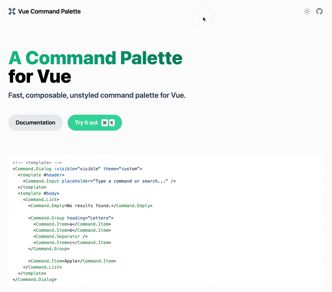
Command Palette for Vue
A fast, composable, unstyled command palette interface for Vue.
README
Command Palette for Vue


A fast, composable, unstyled command + k interface (Command Palette) for Vue.
Preview
Concepts
Command palette interfaces are used to create a web experience where users can quickly get in charge with keyboard shortcuts, rather than using the mouse.
With macOS's Spotlight and Raycast's command palette experience in mind, vue-command-palette is designed to provide a fast, composable, unstyled command palette to your site.
Features
- 🧩 Compound Component + Namespaced Components Design
- 💄 Completely unstyled, but more customizable
- 🔍 Fuzzy search support to find relevant command
- ⌨️ keyboard shortcut support to bind custom keybindings to your command
Install
- ``` sh
- yarn add vue-command-palette
- # or
- pnpm add vue-command-palette
- ```
Usage
Then you can import the Command Compound Component in your project.
- ```vue
- <template>
- <Command theme="custom">
- <Command.Input placeholder="Type a command or search..." />
- <Command.List>
- <Command.Empty>No results found.</Command.Empty>
- <Command.Group heading="Letters">
- <Command.Item>a</Command.Item>
- <Command.Item>b</Command.Item>
- <Command.Separator />
- <Command.Item>c</Command.Item>
- </Command.Group>
- <Command.Item>Apple</Command.Item>
- </Command.List>
- </Command>
- </template>
- <script lang="ts" setup>
- import { ref } from 'vue'
- import { Command } from 'vue-command-palette'
- </script>
- <style>
- // import your custom css
- @import '~/assets/css/custom.css';
- </style>
- ```
or in a dialog:
- ```vue
- <template>
- <Command.Dialog :visible="visible" theme="custom">
- <template #header>
- <Command.Input placeholder="Type a command or search..." />
- </template>
- <template #body>
- <Command.List>
- <Command.Empty>No results found.</Command.Empty>
- <Command.Group heading="Letters">
- <Command.Item>a</Command.Item>
- <Command.Item>b</Command.Item>
- <Command.Separator />
- <Command.Item>c</Command.Item>
- </Command.Group>
- <Command.Item>Apple</Command.Item>
- </Command.List>
- </template>
- </Command.Dialog>
- </template>
- <script lang="ts" setup>
- import { ref } from 'vue'
- import { Command } from 'vue-command-palette'
- const visible = ref(false)
- </script>
- <style>
- // import your custom css
- @import '~/assets/css/custom.css';
- </style>
- ```
Do I have to use command + K? No, it's just a convention that you can use any key binding to perform the Command Palette.
Tips, we use @vueuse/core to bind the keybindings
- ``` html
- <script lang="ts" setup>
- import { watch } from 'vue'
- import { useMagicKeys } from '@vueuse/core'
- const keys = useMagicKeys()
- const CmdK = keys['Meta+K']
- watch(CmdK, (v) => {
- if (v) {
- console.log('Meta + K has been pressed')
- // do your own logic, maybe make dialog visible
- }
- })
- </script>
- ```
Events
| Name | Description | Parameters |
| :-----------: | --------------------------------------------------------------------- | :--------------- |
| select-item | Every time an item is being selected in Command or Command.Dialog | (item) => void |
Styling
All namespaced components have a specific data-attribute starting with command- that can be used for styling.
eg:
- ```css
- div[command-root=''] {
- background: #ffffff;
- }
- ```
Animation
Command.Dialog
Command.Dialog wraped by built-in components Transition, you can customize the animation using the namecommand-dialog .
List Item Height
Animate height using the --command-list-height CSS variable.
Namespaced components
Command [command-root=""]
The root component, Passes the theme props to set your own style.
- ```vue
- <Command theme="custom">
- </Command>
- ```
Command.Dialog [command-dialog=""]
The root component with a dialog interface, Teleport dialog tobody tag. Passes the theme props to set your own style, and visible props control whether render it.
- ```vue
- <Command.Dialog :visible="visible" theme="custom">
- <template #header></template>
- <template #body></template>
- <template #footer></template>
- </Command.Dialog>
- ```
data-attribute within dialog
- [command-dialog-mask] - the mask is always rendered.
- [command-dialog-wrapper] - the wrapper on top of mask.
- [command-dialog-header] - the parent of dialog header slot.
- [command-dialog-body] - the parent of dialog body slot.
- [command-dialog-footer] - the parent of dialog footer slot.
Command.Input [command-input=""]
Usually we need a input in the command palette to search sth.
- ```vue
- <Command.Input
- placeholder="Type a command or search..."
- v-model:value="inputValue"
- />
- ```
Command.List [command-list=""]
Contains items and groups. Animate height using the --command-list-height CSS variable.
- ```css
- [command-list] {
- min-height: 300px;
- height: var(--command-list-height);
- max-height: 500px;
- transition: height 100ms ease;
- }
- ```
- ```vue
- <Command.List>
- </Command.List>
- ```
Command.Group [command-group=""]
Group items ([command-group-items]) together with the given heading ([command-group-heading])
- ```vue
- <Command.Group heading="Perference">
- <Command.Item>Toggle Dark Mode</Command.Item>
- <Command.Item>Change Language</Command.Item>
- </Command.Group>
- ```
Command.Item [command-item=""]
Passed the data-value, we use data-value to fetch the value.
- ```vue
- <Command.Item
- v-for="item in items"
- :data-value="item.label"
- :shortcut="item.shortcut"
- :perform="item.perform"
- @select="(itemInfo) => console.log('selected', itemInfo)"
- // the itemInfo.value is some as `data-value`
- >
- {{ item.label }}
- </Command.Item>
- ```
Command.Separator [command-separator=""]
Usually used to distinguish between different groups
Command.Empty [command-empty=""]
Automatically renders when there are no results for the search query.
Command.Loading [command-loading=""]
Your should manually control loading
Inspiration
- cmdk - Fast, unstyled command menu React component.
- kbar - fast, portable, and extensible cmd+k interface for your site.
License
MIT @xiaoluoboding
