 探客时代
探客时代

Vanilla Colorful
A tiny color picker custom element for modern web apps (2.7 KB)
README
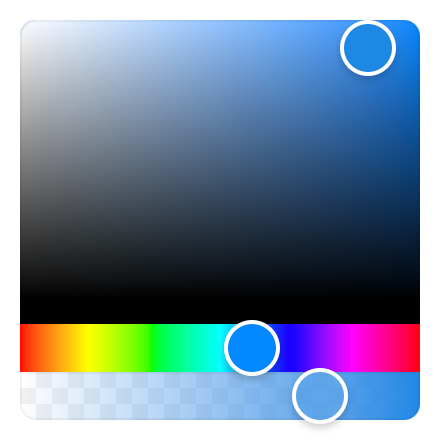

vanilla-colorful is a port of react-colorful to vanilla Custom Elements.
Features
- 🗜 Small: Just 2,7 KB (minified and gzipped). Size Limit controls the size.
- 🚀 Fast: Built with standards based Custom Elements.
- 🛡 Bulletproof: Written in strict TypeScript and has 100% test coverage.
- 🗂 Typed: Ships with types included.
- 😍 Simple: The interface is straightforward and easy to use.
- 💬 Accessible: Follows the WAI-ARIA guidelines to support users of assistive technologies.
- 📲 Mobile-friendly: Works well on mobile devices and touch screens.
- 👫 Framework-agnostic: Can be used with any framework.
- 💨 No dependencies
Live demos
- Website
Install
- ```
- npm install vanilla-colorful --save
- ```
Or use one of the following content delivery networks:
- ``` html
- <script type="module" src="https://unpkg.com/vanilla-colorful?module"></script>
- ```
- ``` html
- <script type="module" src="https://cdn.skypack.dev/vanilla-colorful"></script>
- ```
- ``` html
- <script type="module" src="https://jspm.dev/vanilla-colorful"></script>
- ```
- ``` html
- <script type="module" src="https://esm.sh/vanilla-colorful"></script>
- ```
Usage
- ``` html
- <hex-color-picker color="#1e88e5"></hex-color-picker>
- <script type="module">
- import 'vanilla-colorful';
- const picker = document.querySelector('hex-color-picker');
- picker.addEventListener('color-changed', (event) => {
- // get updated color value
- const newColor = event.detail.value;
- });
- // get current color value
- console.log(picker.color);
- </script>
- ```
ES modules
vanilla-colorful is authored using ES modules which are natively supported
by modern browsers. However, all the code examples listed here use so-called "bare module specifiers":
import 'vanilla-colorful'.
There is now a feature in the HTML Standard called import maps
that enables resolving bare module specifiers without requiring any tools. As of October 2022, import
maps are not yet shipped in all browsers.
In the meantime, we recommend using one of the tools that leverage ES modules based development, such as
[vite](https://vitejs.dev), [@web/dev-server](https://modern-web.dev/docs/dev-server/overview/),
or [wmr](https://www.npmjs.com/package/wmr). None of these tools are needed when importing from CDN.
Supported color models
The default vanilla-colorful's input/output format is a HEX string (like #ffffff). In case if
you need another color model, we provide 12 additional color picker bundles.
How to use another color model
Available pickers
| File | HTML | Value |
|---|---|---|
| ------------------------------- | ---------------------------- | ---------------------------------- |
| `"hex-color-picker.js"` | ` | `"#ffffff"` |
| `"hex-alpha-color-picker.js"` | ` | `"#ffffff88"` |
| `"hsl-color-picker.js"` | ` | `{ |
| `"hsl-string-color-picker.js"` | ` | `"hsl(0, |
| `"hsla-color-picker.js"` | ` | `{ |
| `"hsla-string-color-picker.js"` | ` | `"hsla(0, |
| `"hsv-color-picker.js"` | ` | `{ |
| `"hsv-string-color-picker.js"` | ` | `"hsv(0, |
| `"hsva-color-picker.js"` | ` | `{ |
| `"hsva-string-color-picker.js"` | ` | `"hsva(0, |
| `"rgb-color-picker.js"` | ` | `{ |
| `"rgba-color-picker.js"` | ` | `{ |
| `"rgb-string-color-picker.js"` | ` | `"rgb(255, |
| `"rgba-string-color-picker.js"` | ` | `"rgba(255, |
Code example
- ``` html
- <rgba-color-picker></rgba-color-picker>
- <script type="module">
- import 'vanilla-colorful/rgba-color-picker.js';
- const picker = document.querySelector('rgba-color-picker');
- picker.color = { r: 50, g: 100, b: 150, a: 1 };
- </script>
- ```
Overriding styles
vanilla-colorful exposes CSS Shadow Parts
allowing to override the default styles:
- ```css
- hex-color-picker {
- height: 250px;
- }
- hex-color-picker:
- bottom: 30px;
- border-radius: 3px 3px 0 0;
- }
- hex-color-picker:
- height: 30px;
- border-radius: 0 0 3px 3px;
- }
- hex-color-picker:
- border-radius: 5px;
- }
- hex-color-picker:
- border-radius: 2px;
- width: 15px;
- height: inherit;
- }
- ```
HEX input
- ``` html
- <hex-input color="#1e88e5"></hex-input>
- <script type="module">
- import 'vanilla-colorful/hex-input.js';
- const input = document.querySelector('hex-input');
- input.addEventListener('color-changed', (event) => {
- const newColor = event.detail.value;
- });
- </script>
- ```
| Property | Default | Description |
|---|---|---|
| ---------- | ------- | -------------------------------------------- |
| `alpha` | `false` | Allows |
| `prefixed` | `false` | Enables |
Base classes
vanilla-colorful provides a set of base classes that can be imported without registering custom
elements. This is useful if you want to create your own color picker with a different tag name.
- ``` js
- import { RgbBase } from 'vanilla-colorful/lib/entrypoints/rgb.js';
- customElements.define('custom-color-picker', class extends RgbBase {});
- ```
Code Recipes
TypeScript support
vanilla-colorful supports TypeScript and ships with types in the library itself; no need for any other install.
How you can get the most from our TypeScript support
Custom types
While not only typing its own class methods and variables, it can also help you type yours. Depending on
the element you are using, you can also import the type that is associated with the element.
For example, if you are using our `- ```ts
- import type { HslColor } from 'vanilla-colorful/hsl-color-picker';
- const myHslValue: HslColor = { h: 0, s: 0, l: 0 };
- ```
Typed events
All the included custom elements provide overrides for addEventListener and removeEventListener methods
to include typings for the color-changed custom event detail property:
- ```ts
- const picker = document.querySelector('rgba-color-picker');
- picker.addEventListener('color-changed', (event) => {
- console.log(event.detail.value.a); // (property) RgbaColor.a: number
- });
- ```
Lit plugin
All the included custom elements are compatible with lit-analyzer and
lit-plugin extension for Visual
Studio Code, so you can benefit from type checking in Lit templates, for example
Browser support
and does not support IE11 or legacy Edge.
Why vanilla-colorful?
vanilla-colorful has all the benefits of react-colorful
with one important difference.
While react-colorful claims to have zero dependencies, it still expects you to use React or Preact.
This means that Angular, Vue, Svelte or vanilla JS users would have an extra dependency in their apps.
Now when all the evergreen browsers support standards based Custom Elements,
it's perfect time to build such tiny and lightweight UI controls as web components rather than framework components.
