 探客时代
探客时代

react-notifications-component
Delightful and highly customisable React Component to notify your users
README

react-notifications-component
A delightful, easy to use and highly configurable component to help you notify your users out of the box. No messy setup, just beautiful notifications!
Demo
https://teodosii.github.io/react-notifications-component/
Features
Touch support
Responsive notifications
Standard notification types
Custom notification types
Custom notification content
Dismissable (touch, click, timeout)
Customizable transitions
Small library
Getting started
- ```
- npm install react-notifications-component
- ```
Development
First build the library
- ```
- npm run build:library:dev
- ```
then run the webpack server to see the app running
- ```
- npm run start
- ```
Usage
react-notifications-component
- ``` js
- import { ReactNotifications } from 'react-notifications-component'
- ```
CSS theme
- ``` js
- import 'react-notifications-component/dist/theme.css'
- ```
SASS
SASS files are located in `react-notifications-component/dist/scss`
react-notifications-component at the top of your application so that it does not conflict with other absolutely positioned DOM elements.
- ``` js
- const App = () => {
- return (
- <div className="app-container">
- <ReactNotifications />
- <Application />
- </div>
- )
- };
- ```
Store where needed - will be used to access `addNotification` and `removeNotification` API methods
- ``` js
- import { Store } from 'react-notifications-component';
- ```
Then call addNotification and watch the magic happens
- ``` js
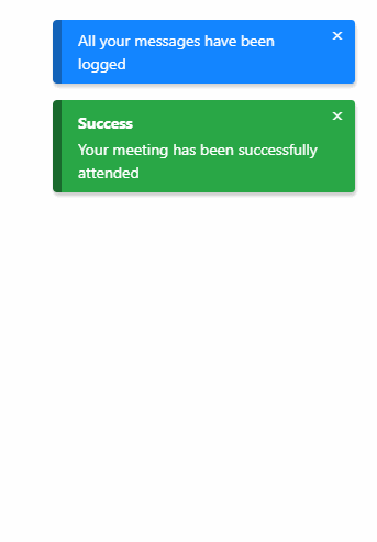
- Store.addNotification({
- title: "Wonderful!",
- message: "teodosii@react-notifications-component",
- type: "success",
- insert: "top",
- container: "top-right",
- animationIn: ["animate__animated", "animate__fadeIn"],
- animationOut: ["animate__animated", "animate__fadeOut"],
- dismiss: {
- duration: 5000,
- onScreen: true
- }
- });
- ```
Voila!
Note: We rely on animate.css in this example as animate__fadeIn and animate__fadeOut are part of animate.css. We recommend using it as it's an excellent animation library, but you're not forced to. If you prefer you may also use your custom animations as long as they're valid CSS animations.
Note: animate.css latest version (v4) has breaking changes. It introduces animate__ prefix so that existing classes don't clash. If you still would like to use classes without prefix you can import animate.css/animate.compat.css
- ``` js
- // preferred way to import (from `v4`). Uses `animate__` prefix.
- import 'animate.css/animate.min.css';
- // Alternate way to use classes without prefix like `animated fadeIn`
- import 'animate.css/animate.compat.css'
- ```
In the examples, we will be using classes with animate__ prefix, which is the default behaviour of latest v4 version of animate.css.
For more info on how to use animate.css, please refer to animate.css docs
API
Store.addNotification(options)
Render a new notification. Method returns a unique id for the rendered notification. Supplied options are internally validated and an exception will be thrown if validation fails.
Store.removeNotification(id)
Manually remove a notification by id.
Examples
In the following examples for brevity some options will not be mentioned. Strictly focusing on the needed options to present each example. For reference, we will be using Object spread operator on a notification object to have non relevant fields included as well.
- ``` js
- notification = {
- title: "Wonderful!",
- message: "Configurable",
- type: "success",
- insert: "top",
- container: "top-right",
- animationIn: ["animate__animated animate__fadeIn"], // `animate.css v4` classes
- animationOut: ["animate__animated animate__fadeOut"] // `animate.css v4` classes
- };
- ```
Notification container
You have in total 6 containers for desktop and 2 for mobile, if component is set to be responsive. List of containers:
top-left
top-right
top-center
center
bottom-left
bottom-right
bottom-center
- ``` js
- Store.addNotification({
- ...notification,
- container: 'top-right'
- })
- ```
Will position the notification in top right of the screen.
Notification type
List of types:
success
danger
info
default
warning
- ``` js
- Store.addNotification({
- ...notification,
- type: 'danger'
- })
- ```
Will trigger a danger notification.
Animating
- ``` js
- Store.addNotification({
- ...notification,
- animationIn: ['animate__animated animate__fadeIn'], // `animate.css v4` classes
- animationOut: ['animate__animated animate__fadeOut'] // `animate.css v4` classes
- })
- ```
animationIn and animationOut rely on CSS classes that toggle animations. On github pages we rely on animate.css, we suggest you to import that package and use their animations as they have plenty.
Note: Failing to have animations set properly will lead to bugs in some causes, as react-notifications-component relies on onAnimationEnd event to know when an animation has finished.
Dismiss notification automatically after timeout expires
- ``` js
- Store.addNotification({
- ...notification,
- dismiss: {
- duration: 2000
- }
- })
- ```
Dismiss notification automatically with the time left shown on UI
- ``` js
- Store.addNotification({
- ...notification,
- dismiss: {
- duration: 2000,
- onScreen: true
- }
- })
- ```
Subscribe to notification's removal
Easily subscribe to onRemoval by supplying callback as option to the notification object. Callback will get called after the removal animation finishes.
- ``` js
- Store.addNotification({
- ...notification,
- onRemoval: (id, removedBy) => {
- ...
- }
- })
- ```
Pause notification's timeout by hovering
- ``` js
- Store.addNotification({
- ...notification,
- dismiss: {
- duration: 2000,
- pauseOnHover: true
- }
- })
- ```
Change transition
- ``` js
- Store.addNotification({
- ...notification,
- slidingExit: {
- duration: 800,
- timingFunction: 'ease-out',
- delay: 0
- }
- })
- ```
slidingEnter, touchRevert and touchSlidingExit can all be configured in the same way, with the mention that touchSlidingExit has 2 transitions nested.
- ``` js
- Store.addNotification({
- ...notification,
- touchSlidingExit: {
- swipe: {
- duration: 400,
- timingFunction: 'ease-out',
- delay: 0,
- },
- fade: {
- duration: 400,
- timingFunction: 'ease-out',
- delay: 0
- }
- }
- })
- ```
Props
| Name | Type | Description |
|---|---|---|
isMobile |
Boolean |
Set whether you want component to be responsive or not. To be used together with breakpoint |
breakpoint |
Number |
Breakpoint for responsiveness - defaults to 768px |
types |
Array |
Custom types |
className |
string |
Classes assigned to the container |
id |
string |
Id of the container |
Options
| Name | Type | Description |
|---|---|---|
id |
String |
Id of the notification. Supply option only if you prefer to have custom id, otherwise you should let the component handle generation for you. |
onRemoval |
Function |
Gets called on notification removal with id and removedBy arguments |
title |
String, React Node or Functional Component |
Title of the notification. Option is ignored if content is set, otherwise it is required. |
message |
String, React Node or Functional Component |
Message of the notification. Option is ignored if content is set, otherwise it is required. |
content |
Object |
Custom notification content, must be either Class Component, Functional Component or React element. If being supplied as functional or class component, id and notificationConfig will be supplied as prop. notificationConfig will return the parsed notification object as defined in the library. |
type |
String |
Type of the notification. Option is ignored if content is set, otherwise it is required. |
container |
String |
Container in which the notification will be displayed. Option is required. |
insert |
String |
Specify where to append notification into the container - top or bottom. Option defaults to top. |
dismiss |
Dismiss |
Specify how a notification should be dismissed. |
animationIn |
Array |
Array of CSS classes for animating the notification's entrance. |
animationOut |
Array |
Array of CSS classes for animating the notification's exit. |
slidingEnter |
Transition |
Transition to be used when sliding to show a notification. |
slidingExit |
Transition |
Transition to be used when sliding to remove a notification. |
touchRevert |
Transition |
Transition to be used when sliding back after an incomplete swipe. |
touchSlidingExit |
Transition |
Transition to be used when sliding on swipe. |
width |
Number |
Overwrite notification's width defined by CSS |
Transition
Transition is used each time you define a transition.
| Name | Type | Description |
|---|---|---|
duration |
Number |
Transition duration in ms. Its default value ranges from 300 to 600, depending on transition |
timingFunction |
String |
CSS timing function for the transition, defaults to linear |
delay |
Number |
Delay of the transition in ms, defaults to 0 |
Dismiss
Dismiss is used to describe how a notification should be dismissed.
| Name | Type | Description |
|---|---|---|
duration |
Number |
Time in milliseconds after notification gets dismissed. 0 will act as infinite duration. Defaults to 0 |
onScreen |
Boolean |
Show time left directly on the notification. Defaults to false |
pauseOnHover |
Boolean |
Hovering over notification will pause the dismiss timer. Defaults to false |
waitForAnimation |
Boolean |
When removing a notification by default we trigger the exit animation and the transition to height 0 at the same time. Setting this to true will wait for the exit animation to finish and then start the transition to height 0. Defaults to false |
click |
Boolean |
Enable dismissal by click, defaults to true |
touch |
Boolean |
Enable dismiss by touch move, defaults to true |
showIcon |
Boolean |
Show or hide the close icon, defaults to false. If set to true, it will respond to click interaction and will remove notification |
Migration from v1
Ref usage has been deprecated. Import Store from library and use it for adding and removing notifications
touchSlidingBack has been renamed to touchRevert
Default values for transitions have been slightly changed
dismissIcon has been removed. Use showIcon instead. If you relly on customized close icon, then stick to custom content.
dismiss supports now more options
cubicBezier has been renamed to timingFunction
Validators are now no longer included in the prod build, they are only included in the dev build. If you inspect the npm package you will see that the component has 2 builds - dev and prod - and relies on ENV variable when importing.
License
MIT
