 探客时代
探客时代

PrimeVue
Next Generation Vue UI Component Library
README

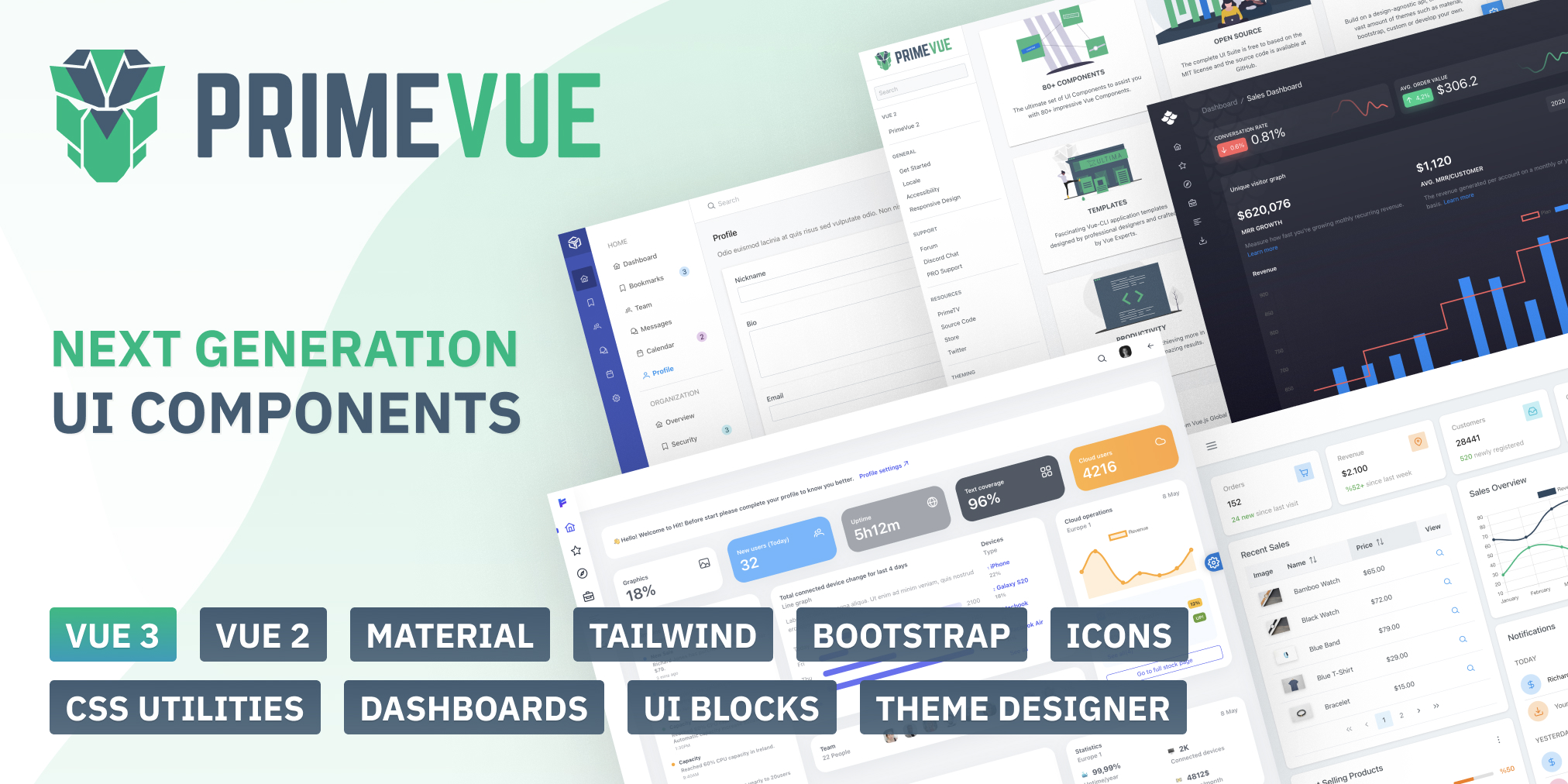
PrimeVue
PrimeVue is a rich set of open source UI Components for Vue. See PrimeVue homepage for live showcase and documentation.
Download
PrimeVue is available at npm, if you have an existing application run the following command to download it to your project.
- ````
- npm install primevue@^3 --save
- npm install primeicons --save
- ````
or
- ```
- yarn add primevue
- yarn add primeicons
- ```
Next step is setting up PrimeVue configuration.
- ``` js
- import {createApp} from 'vue';
- import App from './App.vue';
- import PrimeVue from 'primevue/config';
- const app = createApp(App);
- app.use(PrimeVue);
- ```
Import
Module
- ``` js
- import {createApp} from 'vue';
- import App from './App.vue';
- import PrimeVue from 'primevue/config';
- import Dialog from 'primevue/dialog';
- const app = createApp(App);
- app.use(PrimeVue);
- app.component('Dialog', Dialog);
- ```
Finally you'll be able to utilize the component in your application. See the Styles section to apply styling.
- ```vue
- <Dialog></Dialog>
- ```
CDN
- ``` js
- <script src="https://unpkg.com/primevue@^3/core/core.min.js"></script>/script>
- <script src="https://unpkg.com/primevue@^3/multiselect/multiselect.min.js"></script>
- ```
Single File Components
SFC files are available in the npm distribution and if you'd like to use SFCs directly, add /sfc as a suffix when referencing an import path. This will instruct your bundler to process the *.vue files in your local build instead of using the compiled output. One use case for this approach is optimizing for SSR by removing whitespaces.
- ``` js
- import Dialog from 'primevue/dialog/sfc';
- ```
Script Tag
Other alternative is utilizing the components directly within the browser with the iife build. Note that PrimeVue does not provide a umd build.
- ``` js
- <html>
- <head>
- <meta charset="utf-8">
- <title>PrimeVue Demo</title>
- <link href="https://unpkg.com/primevue/resources/themes/lara-light-indigo/theme.css" rel="stylesheet">
- <link href="https://unpkg.com/primevue/resources/primevue.min.css" rel="stylesheet">
- <link href="https://unpkg.com/primeicons/primeicons.css" rel="stylesheet">
- <script src="https://unpkg.com/vue@next"></script>
- <script src="https://unpkg.com/primevue^3/core/core.min.js"></script>
- <script src="https://unpkg.com/primevue^3/slider/slider.min.js"></script>
- </head>
- <body>
- <div id="app">
- <p-slider v-model="val"></p-slider>
- <h6>{{val}}</h6>
- </div>
- <script>
- const {createApp, ref} = Vue;
- const App = {
- setup() {
- const val = ref(null);
- return {
- val
- };
- },
- components: {
- 'p-slider': primevue.slider
- }
- };
- createApp(App).use(primevue.config.default).mount("#app");
- </script>
- </body>
- </html>
- ```
Styles
The css dependencies are as follows, note that you may change the theme with another one of your choice.
- ```css
- primevue/resources/themes/saga-blue/theme.css //theme
- primevue/resources/primevue.min.css //core css
- primeicons/primeicons.css //icons
- ```
If you are using a bundler such as webpack with a css loader you may also import them to your main application component.
- ``` js
- import 'primevue/resources/themes/lara-light-indigo/theme.css';
- import 'primevue/resources/primevue.min.css';
- import 'primeicons/primeicons.css';
- ```
Nuxt Integration
Nuxt 3 is currently in beta and an official module is planned after the final release. At the moment, PrimeVue can easily be used with Nuxt 3 using a custom plugin.
nuxt.config.js
Open the nuxt configuration file and add the css dependencies.
- ``` js
- import { defineNuxtConfig } from 'nuxt3';
- export default defineNuxtConfig({
- css: [
- 'primevue/resources/themes/saga-blue/theme.css',
- 'primevue/resources/primevue.css',
- 'primeicons/primeicons.css'
- ],
- build: {
- transpile: ['primevue']
- }
- })
- ```
primevue.js
Create a file like primevue.js under the plugins directory for the configuration.
- ``` js
- import { defineNuxtPlugin } from "#app";
- import PrimeVue from "primevue/config";
- import Button from "primevue/button";
- export default defineNuxtPlugin((nuxtApp) => {
- nuxtApp.vueApp.use(PrimeVue, {ripple: true});
- nuxtApp.vueApp.component('Button', Button);
- //other components that you need
- });
- ```
Configuration
Dependencies
PrimeVue components are not wrappers and implemented natively with the Vue APIs. There are some exceptions having 3rd party dependencies such as Quill for Editor.
In addition, components require PrimeIcons library for icons.
- ``` js
- dependencies: {
- "vue": "^3.0.0",
- "primeicons": "^6.0.0"
- }
- ```
Prop Cases
Component prop names are described as camel case throughout the documentation however camel-case is also fully supported. Events on the other hand should always be camel-case.
- ```vue
- <Dialog :showHeader="false"></Dialog>
- <Dialog :show-header="false"></Dialog>
- ```
Ripple
Ripple is an optional animation for the supported components such as buttons. It is disabled by default and needs to be enabled at your app's entry file (e.g. main.js) during the PrimeVue setup.
- ``` js
- import {createApp} from 'vue';
- import PrimeVue from 'primevue/config';
- const app = createApp(App);
- app.use(PrimeVue, {ripple: true});
- ```
Outlined vs Filled Input Styles
Input fields come in two styles, default is outlined with borders around the field whereas filled alternative adds a background color to the field. Applying p-input-filled to an ancestor of an input enables the filled style. If you prefer to use filled inputs in the entire application, use a global container such as the document body or the application element to apply the style class. Note that in case you add it to the application element, components that are teleported to the document body such as Dialog will not be able to display filled inputs as they are not a descendant of the application root element in the DOM tree, to resolve this case set inputStyle to 'filled' at PrimeVue configuration as well.
- ``` js
- import {createApp} from 'vue';
- import PrimeVue from 'primevue/config';
- const app = createApp(App);
- app.use(PrimeVue, {inputStyle: 'filled'});
- ```
ZIndex Layering
ZIndexes are managed automatically to make sure layering of overlay components work seamlessly when combining multiple components. Still there may be cases where you'd like to configure the configure default values such as a custom layout where header section is fixed. In a case like this, dropdown needs to be displayed below the application header but a modal dialog should be displayed above. PrimeVue configuration offers the zIndex property to customize the default values for components categories. Default values are described below and can be customized when setting up PrimeVue.
- ``` js
- import {createApp} from 'vue';
- import PrimeVue from 'primevue/config';
- const app = createApp(App);
- app.use(PrimeVue, {
- zIndex: {
- modal: 1100, //dialog, sidebar
- overlay: 1000, //dropdown, overlaypanel
- menu: 1000, //overlay menus
- tooltip: 1100 //tooltip
- }
- });
- ```
Locale
PrimeVue provides a Locale API to support i18n and l7n, visit the Locale documentation for more information.
Quickstart with Create Vue
An example application based on Create Vue is available at github.
Quickstart with Create Vue TypeScrript
An sample application based on Create Vue is available at github.
Quickstart with Vue CLI
An example application based on Vue CLI is available at github.
Quickstart with Vite
A starter application is also provided for Vite users.
Quickstart with Nuxt
A sample application is created for Nuxt 3 users.
Quickstart with TypeScript
Typescript is fully supported as type definition files are provided in the npm package of PrimeVue. A sample typescript-primevue application with Vue CLI is available as at github.
