 探客时代
探客时代

Zeego
Menus for React (Native) done right.
README

Beautiful, native menus for React Native + Web, inspired by Radix UI.
- 🕺 Radix UI on Web
- 🛫 Native elements on iOS/Android (where possible)
- 🌲 Same API cross-platform
- 🌊 Works with Solito and Next.js
- 🤖 Supports Expo (with custom dev clients)
- 🍦 Vanilla React Native too
- 🎨 100% unstyled components
About Zeego
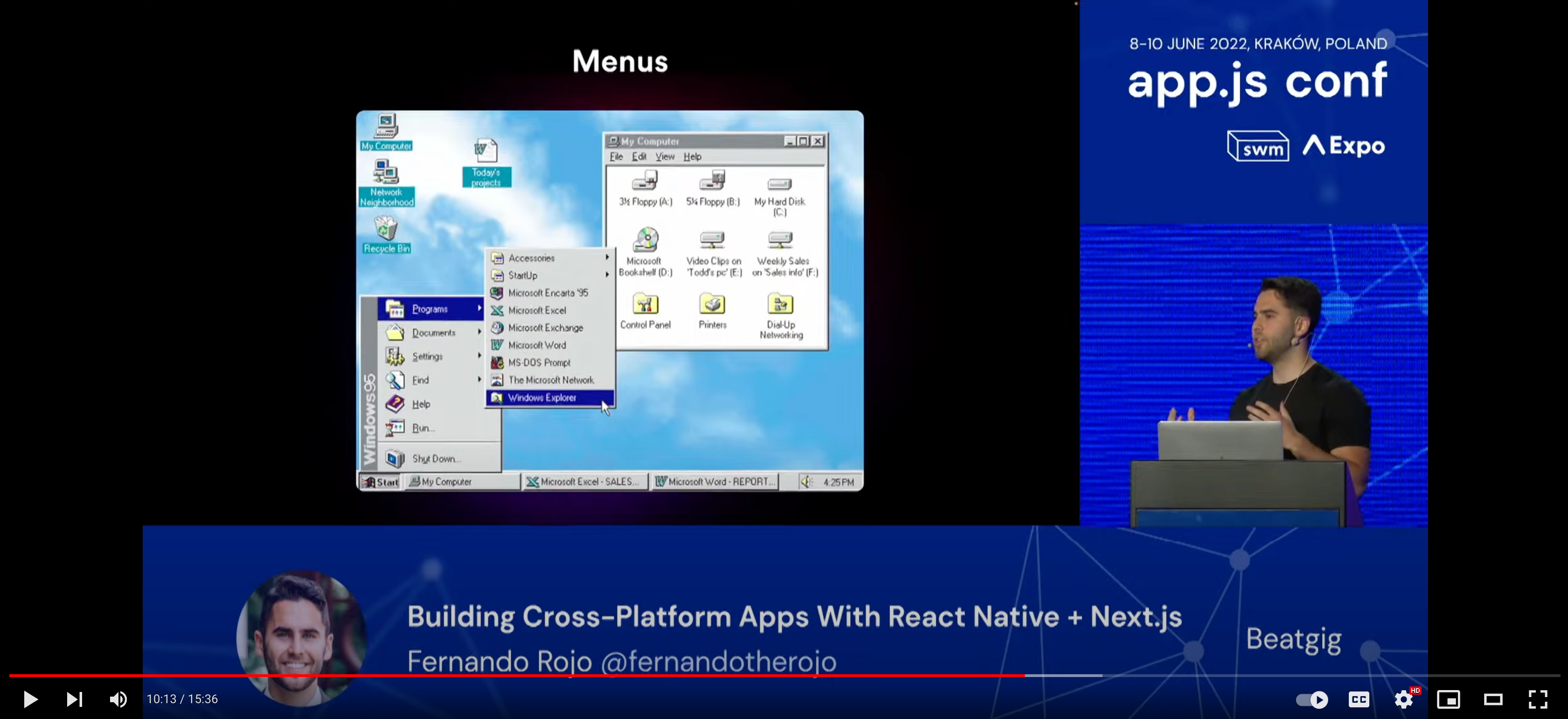
To learn more about Zeego and its approach to menus, you can watch Fernando Rojo's talk at App.js Conf.
The Zeego release happens at about 9:35.
Installation
- ```sh
- yarn add zeego
- ```
Install peer dependencies
If you're in a monorepo, you should install these in the directory of your native app.
iOS
- ```sh
- yarn add react-native-ios-context-menu
- ```
Android
- ```sh
- yarn add @react-native-menu/menu
- ```
Solito
As shown above, sure to install react-native-ios-context-menu and @react-native-menu/menu in your Expo folder (apps/expo).
You should also follow the Next.js steps below.
Next.js
You need to add zeego to your next-transpile-modules in next.config.js.
Expo
You need to use a custom development client, since react-native-ios-context-menu uses native code.
After installing, you'll need to rebuild your custom development client and app.
Vanilla React Native
Run pod install in your ios folder.
Philosophy
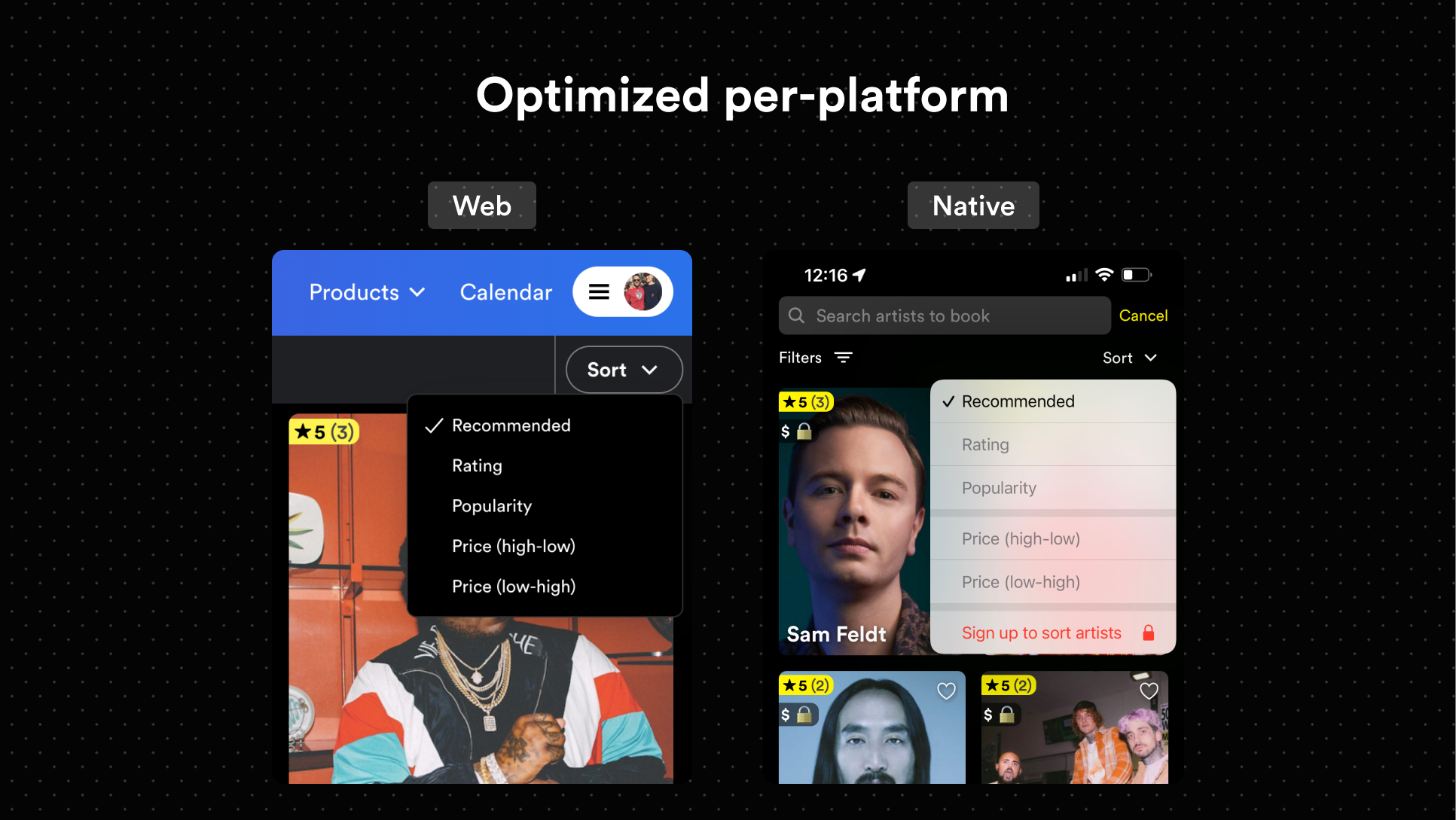
1. Use the best API possible
2. Create the best experience for each platform, without concern for sharing styles
3. Rely on built-in native menus for iOS and Android
4. Everything ships unstyled
The API follows that of Radix UI closely.
Usage
- ```ts
- import * as DropdownMenu from 'zeego/dropdown-menu'
- ```
See radix-ui's dropdown menu. It's really similar.
One difference is that DropdownMenu.Item needs a child DropdownMenu.ItemTitle, since React Native separates Text and View components.
- ```tsx
- <DropdownMenu.Item>
- <DropdownMenu.ItemTitle>Bookmark</DropdownMenu.ItemTitle>
- <DropdownMenu.ItemIcon iosIconName="bookmark">
- <YourIconComponent />
- </DropdownMenu.ItemIcon>
- </DropdownMenu.Item>
- ```
Custom components
To use a custom component, you'll first need to menuify it.
Here is an example of a custom component using Dripsy:
- ```tsx
- import * as DropdownMenu from 'zeego/dropdown-menu'
- import { styled } from 'dripsy'
- const StyledMenuItem = styled(DropdownMenu.Item)({
- height: 32,
- })
- // this part is important
- const DripsyMenuItem = DropdownMenu.menuify(StyledMenuItem, 'Item')
- ```
And now, you can use it:
- ```tsx
- <DripsyMenuItem key="fernando">
- <DropdownMenu.ItemTitle>Fernando</DropdownMenu.ItemTitle>
- <DripsyMenuItem>
- ```
Under the hood, menuify applies a displayName to your component. This allows zeego to recognize it when it's mapping children for iOS and Android.
Example
For now, you should reference the example in the repo.
I also added a Moti + Dripsy example.
In the future, I'll make an example app with Solito too.
- ```tsx
- const DropdownMenuExample = () => {
- const [bookmarked, setBookmarked] = useState<'on' | 'off' | 'mixed'>('on')
- return (
- <DropdownMenu.Root>
- <DropdownMenu.Trigger>
- <View>
- <Text style={styles.button}>{`<DropdownMenu />`}Text>
- </View>
- </DropdownMenu.Trigger>
- <DropdownMenu.Content style={dropdownStyles.content}>
- <DropdownMenuLabel>Help</DropdownMenuLabel>
- <DropdownMenuItem
- style={dropdownStyles.item}
- onSelect={select(1)}
- key="first"
- >
- <DropdownMenuItemTitle style={dropdownStyles.itemTitle}>
- See more
- </DropdownMenuItemTitle>
- {Platform.OS === 'ios' && (
- <DropdownMenu.ItemSubtitle style={dropdownStyles.itemSubtitle}>
- 12 artists fit your search
- </DropdownMenu.ItemSubtitle>
- )}
- <DropdownMenuItemIcon iosIconName="list.star" androidIconName="star_on">
- <Ionicons name="list" size={15} />
- </DropdownMenuItemIcon>
- </DropdownMenuItem>
- <DropdownMenuItem
- style={dropdownStyles.item}
- onSelect={select(2)}
- key="second"
- >
- <DropdownMenuItemTitle>Favorite</DropdownMenuItemTitle>
- <DropdownMenuItemIcon iosIconName="star.fill" androidIconName="star_off">
- <Ionicons name="star" size={15} />
- </DropdownMenuItemIcon>
- </DropdownMenuItem>
- <DropdownMenuCheckboxItem
- style={dropdownStyles.item}
- value={bookmarked}
- onValueChange={setBookmarked}
- key="third"
- >
- <DropdownMenuItemIndicator>
- <Ionicons name="checkmark" size={19} />
- </DropdownMenuItemIndicator>
- <DropdownMenuItemTitle>
- {bookmarked === 'on' ? 'Bookmarked' : 'Bookmark'}
- </DropdownMenuItemTitle>
- <DropdownMenuItemImage
- iosIconName="book"
- source={require('./camera-outline.png')}
- width={20}
- resizeMode="contain"
- />
- </DropdownMenuCheckboxItem>
- </DropdownMenu.Content>
- </DropdownMenu.Root>
- )
- }
- ```
TODO
- [x] zeego/dropdown-menu
- [ ] zeego/context-menu (in-progress, missing Web implementation)
- [x] Android native implementation
- [ ] Docs
- [ ] zeego/tooltip (probably?)
- [ ] zeego/popover (probably)
Thanks
Special thanks to Dominic Go for the awesome iOS context menu. Also, thanks to the Showtime team for testing this and sending PRs.
