 探客时代
探客时代

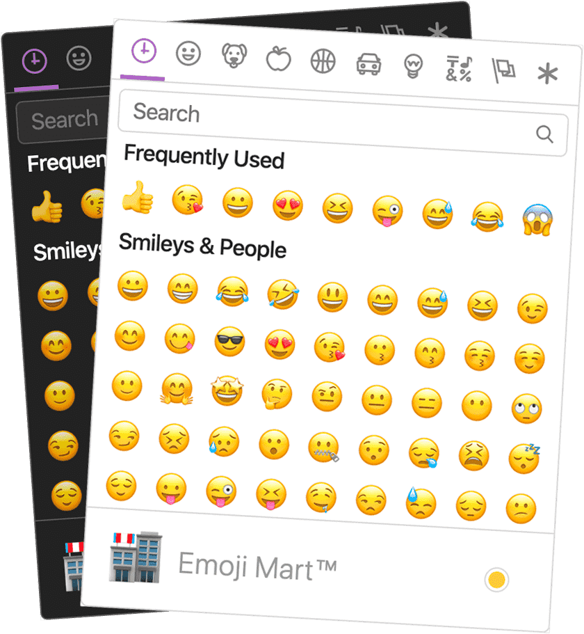
Emoji Mart
One component to pick them all
README
Emoji Mart is a Slack-like customizable
emoji picker component for React
Demo • Changelog

Brought to you by the Missive team
Installation
npm install --save emoji-mart
Components
Picker
- ``` js
- import 'emoji-mart/css/emoji-mart.css'
- import { Picker } from 'emoji-mart'
- <Picker set='apple' />
- <Picker onSelect={this.addEmoji} />
- <Picker title='Pick your emoji…' emoji='point_up' />
- <Picker style={{ position: 'absolute', bottom: '20px', right: '20px' }} />
- <Picker i18n={{ search: 'Recherche', categories: { search: 'Résultats de recherche', recent: 'Récents' } }} />
- ```
| Prop | Required | Default | Description |
|---|---|---|---|
| ---- | :------: | ------- | ----------- |
| **autoFocus** | | | Auto | |
| **color** | | | The | |
| **emoji** | | | The | |
| **include** | | | Only | |
| **exclude** | | | Don't | |
| **custom** | | | [Custom | |
| **recent** | | | Pass | |
| **enableFrequentEmojiSort** | | | Instantly | |
| **emojiSize** | | | The | |
| **onClick** | | | Params: | |
| **onSelect** | | | Params: | |
| **onSkinChange** | | | Params: | |
| **perLine** | | | Number | |
| **i18n** | | | [An | |
| **native** | | | Renders | |
| **set** | | | The | |
| **theme** | | | The | |
| **sheetSize** | | | The | |
| **backgroundImageFn** | | | A | |
| **emojisToShowFilter** | | | A | |
| **showPreview** | | | Display | |
| **showSkinTones** | | | Display | |
| **emojiTooltip** | | | Show | |
| **useButton** | | | When | |
| **skin** | | | Forces | |
| **defaultSkin** | | | Default | |
| **skinEmoji** | | | The | |
| **style** | | | Inline | |
| **title** | | | The | |
| **notFoundEmoji** | | | The | |
| **notFound** | | | [Not | |
| **icons** | | | [Custom |
I18n
- ``` js
- search: 'Search',
- clear: 'Clear', // Accessible label on "clear" button
- notfound: 'No Emoji Found',
- skintext: 'Choose your default skin tone',
- categories: {
- search: 'Search Results',
- recent: 'Frequently Used',
- smileys: 'Smileys & Emotion',
- people: 'People & Body',
- nature: 'Animals & Nature',
- foods: 'Food & Drink',
- activity: 'Activity',
- places: 'Travel & Places',
- objects: 'Objects',
- symbols: 'Symbols',
- flags: 'Flags',
- custom: 'Custom',
- },
- categorieslabel: 'Emoji categories', // Accessible title for the list of categories
- skintones: {
- 1: 'Default Skin Tone',
- 2: 'Light Skin Tone',
- 3: 'Medium-Light Skin Tone',
- 4: 'Medium Skin Tone',
- 5: 'Medium-Dark Skin Tone',
- 6: 'Dark Skin Tone',
- },
- ```
Tip: You usually do not need to translate the categories and skin tones by youself, because this data and their translations should be included in the Unicode CLDR (the "Common Locale Data Repository"). You can look them up and just take them from there.
Sheet sizes
| Set | Size | Size | Size | Size |
|---|---|---|---|---|
| --------- | ---------------------- | ---------------------- | ---------------------- | ---------------------- |
| apple | 407 | 561 | 1.34 | 3.60 |
| 416 | 579 | 1.38 | 3.68 | |
| 362 | 489 | 1.12 | 2.78 | |
| 361 | 485 | 1.05 | 2.39 |
Datasets
While all sets are available by default, you may want to include only a single set data to reduce the size of your bundle.
| Set | Size |
|---|---|
| --------- | -------------- |
| all | 611 |
| apple | 548 |
| 468 | |
| 518 | |
| 517 |
To use these data files (or any other custom data), use the NimblePicker component:
- ``` js
- import data from 'emoji-mart/data/google.json'
- import { NimblePicker } from 'emoji-mart'
- <NimblePicker set='google' data={data} />
- ```
Examples of emoji object:
- ``` js
- {
- id: 'smiley',
- name: 'Smiling Face with Open Mouth',
- colons: ':smiley:',
- text: ':)',
- emoticons: [
- '=)',
- '=-)'
- ],
- skin: null,
- native: '😃'
- }
- {
- id: 'santa',
- name: 'Father Christmas',
- colons: ':santa::skin-tone-3:',
- text: '',
- emoticons: [],
- skin: 3,
- native: '🎅🏼'
- }
- {
- id: 'octocat',
- name: 'Octocat',
- colons: ':octocat:',
- text: '',
- emoticons: [],
- custom: true,
- imageUrl: 'https://github.githubassets.com/images/icons/emoji/octocat.png'
- }
- ```
Emoji
- ``` js
- import { Emoji } from 'emoji-mart'
- <Emoji emoji={{ id: 'santa', skin: 3 }} size={16} />
- <Emoji emoji=':santa::skin-tone-3:' size={16} />
- <Emoji emoji='santa' set='apple' size={16} />
- ```
| Prop | Required | Default | Description |
|---|---|---|---|
| ---- | :------: | ------- | ----------- |
| **emoji** | ✓ | | | |
| **size** | ✓ | | | |
| **native** | | | Renders | |
| **onClick** | | | Params: | |
| **onLeave** | | | Params: | |
| **onOver** | | | Params: | |
| [**fallback**](#unsupported-emojis-fallback) | | | Params: | |
| **set** | | | The | |
| **sheetSize** | | | The | |
| **backgroundImageFn** | | | A | |
| **skin** | | | Skin | |
| **tooltip** | | | Show | |
| [**html**](#using-with-dangerouslysetinnerhtml) | | | Returns |
Unsupported emojis fallback
Certain sets don’t support all emojis. By default the Emoji component will not render anything so that the emojis’ don’t take space in the picker when not available. When using the standalone Emoji component, you can however render anything you want by providing the fallback props.
To have the component render :shrug: you would need to:
- ``` js
- <Emoji
- set={'apple'}
- emoji={'shrug'}
- size={24}
- fallback={(emoji, props) => {
- return emoji ? `:${emoji.short_names[0]}:` : props.emoji
- }}
- />
- ```
Using with dangerouslySetInnerHTML
The Emoji component being a functional component, you can call it as you would call any function instead of using JSX. Make sure you passhtml: true for it to return an HTML string.
- ``` js
- <span dangerouslySetInnerHTML={{
- __html: Emoji({
- html: true
- set: 'apple'
- emoji: '+1'
- size: 24
- })
- }}></span>
- ```
Using with contentEditable
Following the dangerouslySetInnerHTML example above, make sure the wrapping span sets contenteditable="false".
- ``` js
- <div contentEditable={true}>
- Looks good to me
- <span contentEditable={false} dangerouslySetInnerHTML={{
- __html: Emoji({
- html: true
- set: 'apple'
- emoji: '+1'
- size: 24
- })
- }}></span>
- </div>
- ```
Custom emojis
You can provide custom emojis which will show up in their own category. You can either use a single image as imageUrl or use a spritesheet as shown in the second object.
- ``` js
- import { Picker } from 'emoji-mart'
- const customEmojis = [
- {
- name: 'Octocat',
- short_names: ['octocat'],
- text: '',
- emoticons: [],
- keywords: ['github'],
- imageUrl: 'https://github.githubassets.com/images/icons/emoji/octocat.png',
- customCategory: 'GitHub'
- },
- {
- name: 'Test Flag',
- short_names: ['test'],
- text: '',
- emoticons: [],
- keywords: ['test', 'flag'],
- spriteUrl: 'https://unpkg.com/emoji-datasource-twitter@4.0.4/img/twitter/sheets-256/64.png',
- sheet_x: 1,
- sheet_y: 1,
- size: 64,
- sheetColumns: 52,
- sheetRows: 52,
- },
- ]
- <Picker custom={customEmojis} />
- ```
The customCategory string is optional. If you include it, then the custom emoji will be shown in whatever
categories you define. If you don't include it, then there will just be one category called "Custom."
Not Found
You can provide a custom Not Found object which will allow the appearance of the not found search results to change. In this case, we change the default 'sleuth_or_spy' emoji to Octocat when our search finds no results.
- ``` js
- import { Picker } from 'emoji-mart'
- const notFound = () => <img src='https://github.githubassets.com/images/icons/emoji/octocat.png' />
- <Picker notFound={notFound} />
- ```
Custom icons
You can provide custom icons which will override the default icons.
- ``` js
- import { Picker } from 'emoji-mart'
- const customIcons = {
- categories: {
- recent: () => <img src='https://github.githubassets.com/images/icons/emoji/octocat.png' />,
- foods: () => <svg role="img" viewBox="0 0 24 24" xmlns="http://www.w3.org/2000/svg"><path d="M0 0l6.084 24H8L1.916 0zM21 5h-4l-1-4H4l3 12h3l1 4h13L21 5zM6.563 3h7.875l2 8H8.563l-2-8zm8.832 10l-2.856 1.904L12.063 13h3.332zM19 13l-1.5-6h1.938l2 8H16l3-2z"/>svg>,
- people: () => <svg xmlns="http://www.w3.org/2000/svg" width="16" height="16" viewBox="0 0 16 16"><path d="M3 2l10 6-10 6z"></path>svg>
- }
- }
- <Picker icons={customIcons} />
- ```
Headless search
The Picker doesn’t have to be mounted for you to take advantage of the advanced search results.
- ``` js
- import { emojiIndex } from 'emoji-mart'
- emojiIndex.search('christmas').map((o) => o.native)
- // => [🎄, 🎅🏼, 🔔, 🎁, ⛄️, ❄️]
- ```
With custom data
- ``` js
- import data from 'emoji-mart/datasets/apple'
- import { NimbleEmojiIndex } from 'emoji-mart'
- let emojiIndex = new NimbleEmojiIndex(data)
- emojiIndex.search('christmas')
- ```
Get emoji data from Native
You can get emoji data from native emoji unicode using the getEmojiDataFromNative util function.
- ``` js
- import { getEmojiDataFromNative, Emoji } from 'emoji-mart'
- import data from 'emoji-mart/data/all.json'
- const emojiData = getEmojiDataFromNative('🏊🏽♀️', 'apple', data)
- <Emoji
- emoji={emojiData}
- set={'apple'}
- skin={emojiData.skin || 1}
- size={48}
- />
- ```
Example of emojiData object:
- ``` js
- emojiData: {
- "id": "woman-swimming",
- "name": "Woman Swimming",
- "colons": ":woman-swimming::skin-tone-4:",
- "emoticons": [],
- "unified": "1f3ca-1f3fd-200d-2640-fe0f",
- "skin": 4,
- "native": "🏊🏽♀️"
- }
- ```
Storage
By default EmojiMart will store user chosen skin and frequently used emojis in localStorage. That can however be overwritten should you want to store these in your own storage.
- ``` js
- import { store } from 'emoji-mart'
- store.setHandlers({
- getter: (key) => {
- // Get from your own storage (sync)
- },
- setter: (key, value) => {
- // Persist in your own storage (can be async)
- }
- })
- ```
Possible keys are:
| Key | Value | Description |
|---|---|---|
| --- | ----- | ----------- |
| skin | `1, | | |
| frequently | `{ | An |
| last | 'astonished' | (Optional) |
Features
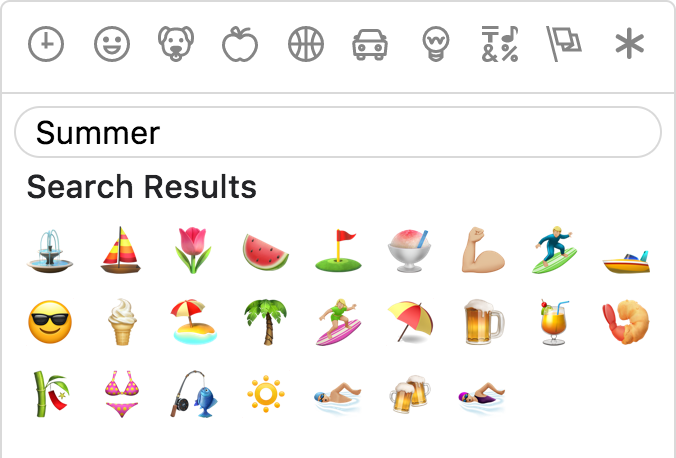
Powerful search
Short name, name and keywords
Not only does Emoji Mart return more results than most emoji picker, they’re more accurate and sorted by relevance.
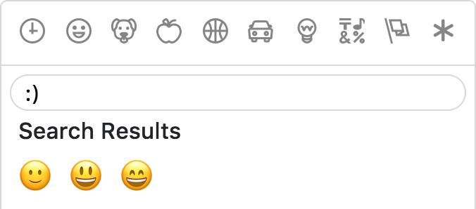
Emoticons
The only emoji picker that returns emojis when searching for emoticons.
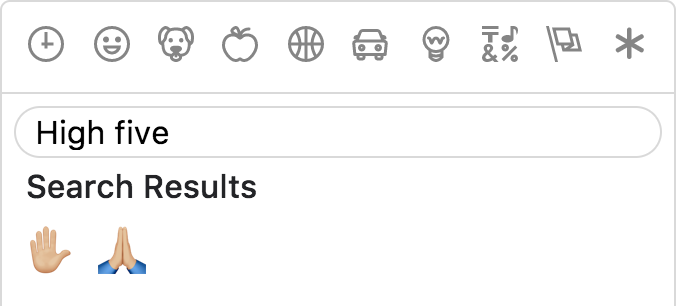
Results intersection
For better results, Emoji Mart split search into words and only returns results matching both terms.
Fully customizable
Anchors color, title and default emoji


Emojis sizes and length
Default skin color
As the developer, you have control over which skin color is used by default.

It can however be overwritten as per user preference.

Multiple sets supported
Apple / Google / Twitter / Facebook

Not opinionated
Emoji Mart doesn’t automatically insert anything into a text input, nor does it show or hide itself. It simply returns an emoji object. It’s up to the developer to mount/unmount (it’s fast!) and position the picker. You can use the returned object as props for the EmojiMart.Emoji component. You could also use emoji.colons to insert text into a textarea or emoji.native to use the emoji.
Usage outside React
Furthermore, you can use it as a custom element using remount, meaning that you can use it within any JavaScript framework (or vanilla JS).
For an end-to-end example of how to do this, see emoji-mart-outside-react.
Optimizing for production
Modern/ES builds
Emoji Mart comes in three flavors:
- ```
- dist
- dist-es
- dist-modern
- ```
- dist is the standard build with the highest level of compatibility.
- dist-es is the same, but uses ES modules for better tree-shaking.
- dist-modern removes features not needed in modern evergreen browsers (i.e. latest Chrome, Edge, Firefox, and Safari).
The default builds are dist and dist-es. (In Webpack, one or the other will be chosen based on your resolve main fields.)
If you want to use dist-modern, you must explicitly import it:
- ``` js
- import { Picker } from 'emoji-mart/dist-modern/index.js'
- ```
Using something like Babel, you can transpile the modern build to suit your own needs.
Removing prop-types
To remove prop-types in production, use babel-plugin-transform-react-remove-prop-types:
- ``` sh
- npm install --save-dev babel-plugin-transform-react-remove-prop-types
- ```
Then add to your .babelrc:
- ``` json
- "plugins": [
- [
- "transform-react-remove-prop-types",
- {
- "removeImport": true,
- "additionalLibraries": [
- "../../utils/shared-props"
- ]
- }
- ]
- ]
- ```
You'll also need to ensure that Babel is transpiling emoji-mart, e.g. [by not excluding node_modules in babel-loader](https://github.com/babel/babel-loader#usage).
Development
- ``` sh
- yarn build
- ```
In two separate tabs:
- ``` sh
- yarn start
- yarn storybook
- ```
The storybook is hosted at localhost:6006, and the code will be built on-the-fly.
🎩 Hat tips!
🙌🏼 Cal Henderson.
Missive mixes team email and threaded group chat for productive teams.
A single app for all your internal and external communication and a full work management solution.
