 探客时代
探客时代

Kepler.gl
A powerful open source geospatial analysis tool for large-scale data sets.
README


kepler.gl | Website | Demo App | Docs
 ](http://kepler.gl)
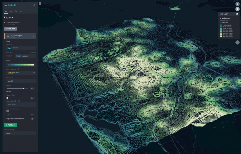 ](http://kepler.gl/#/demo)
[Kepler.gl][web] is a data-agnostic, high-performance web-based application for visual exploration of large-scale geolocation data sets. Built on top of Mapbox GL and deck.gl, kepler.gl can render millions of points representing thousands of trips and perform spatial aggregations on the fly.
Kepler.gl is also a React component that uses Redux to manage its state and data flow. It can be embedded into other React-Redux applications and is highly customizable. For information on how to embed kepler.gl in your app take a look at this step-by-step [tutorial][vis-academy] on vis.academy.
Links
- [Website][web]
- [Demo][demo-app]
- [Examples][examples]
- [Get Started][get-started]
- [App User Guide][user-guide]
- [Jupyter Widget User Guide][user-guide-jupyter]
- [Tutorial][vis-academy]
- [Stack Overflow][stack]
- [Contribution Guidelines][contributing]
- [Api Reference][api-reference]
- [Roadmap][roadmap]
Env
Use Node 10.15.0 or above, older node versions have not been supported/ tested.
For best results, use nvmnvm install.
Install kepler.gl
Install node (> 10.15.0), yarn, and project dependencies
- ```sh
- npm install --save kepler.gl
- // or
- yarn add kepler.gl
- ```
kepler.gl is built upon [mapbox][mapbox]. You will need a [Mapbox Access Token][mapbox-token] to use it.
If you don't use a module bundler, it's also fine. Kepler.gl npm package includes precompiled production UMD builds in the umd folder.
You can add the script tag to your html file as it follows:
- ``` html
- <script src="https://unpkg.com/kepler.gl/umd/keplergl.min.js" />
- ```
or if you would like, you can load a specific version
- ``` html
- <script src="https://unpkg.com/kepler.gl@0.2.2/umd/keplergl.min.js" />
- ```
Develop kepler.gl
Take a look at the [development guide][developers] to develop kepler.gl locally.
Basic Usage
Here are the basic steps to import kepler.gl into your app. You also take a look at the examples folder. Each example in the folder can be installed and run locally.
1. Mount reducer
Kepler.gl uses Redux to manage its internal state, along with [react-palm][react-palm] middleware to handle side effects.
You need to add taskMiddleware of react-palm to your store too. We are actively working on a solution where
react-palm will not be required, however it is still a very lightweight side effects management tool that is easier to test than react-thunk.
- ``` js
- import {createStore, combineReducers, applyMiddleware, compose} from 'redux';
- import keplerGlReducer from 'kepler.gl/reducers';
- import {enhanceReduxMiddleware} from 'kepler.gl/middleware';
- const initialState = {};
- const reducers = combineReducers({
- // <-- mount kepler.gl reducer in your app
- keplerGl: keplerGlReducer,
- // Your other reducers here
- app: appReducer
- });
- // using createStore
- export default createStore(
- reducer,
- initialState,
- applyMiddleware(
- enhanceReduxMiddleware([
- /* Add other middlewares here */
- ])
- )
- );
- ```
Or if use enhancer:
- ``` js
- // using enhancers
- const initialState = {};
- const middlewares = enhanceReduxMiddleware([
- // Add other middlewares here
- ]);
- const enhancers = [applyMiddleware(...middlewares)];
- export default createStore(reducer, initialState, compose(...enhancers));
- ```
If you mount kepler.gl reducer in another address instead of keplerGl, or the kepler.gl reducer is not
mounted at root of your state, you will need to specify the path to it when you mount the component
with the getState prop.
Read more about [Reducers][reducers].
2. Mount Component
- ``` js
- import KeplerGl from 'kepler.gl';
- const Map = props => (
- <KeplerGl
- id="foo"
- width={width}
- mapboxApiAccessToken={token}
- height={height}
- />
- );
- ```
Props
id (String, required)
- Default: map
The id of this KeplerGl instance. id is required if you have multiple
KeplerGl instances in your app. It defines the prop name of the KeplerGl state that is
stored in the KeplerGl reducer. For example, the state of the KeplerGl component with id foo is
stored in state.keplerGl.foo.
In case you create multiple kepler.gl instances using the same id, the kepler.gl state defined by the entry will be
overridden by the latest instance and reset to a blank state.
mapboxApiAccessToken (String, required*)
- Default: undefined
By default, kepler.gl uses mapbox-gl.js to render its base maps. You can create a free account at [mapbox][mapbox] and create a token at [www.mapbox.com/account/access-tokens][mapbox-token].
If you replaced kepler.gl default map styles with your own, and they are not Mapbox styles. mapboxApiAccessToken will not be reuiqred.
Read more about [Custom Map Styles][custom-map-styles].
getState (Function, optional)
- Default: state => state.keplerGl
The path to the root keplerGl state in your reducer.
width (Number, optional)
- Default: 800
Width of the KeplerGl UI.
height (Number, optional)
- Default: 800
appName (String, optional)
- Default: Kepler.Gl
App name displayed in side panel header
version (String, optional)
- Default: v1.0
version displayed in side panel header
onSaveMap (Function, optional)
- Default: undefined
Action called when click Save Map Url in side panel header.
onViewStateChange (Function, optional)
- Default: undefined
- Parameter: viewState - An updated view state object containing parameters such as longitude, latitude, zoom etc
Action triggered when map viewport is updated.
getMapboxRef(mapbox, index) (Function, optional)
- Default: undefined
Function called when KeplerGL adds or removes a MapContainer component having an inner Mapbox map.
The mapbox argument is an [InteractiveMap](https://uber.github.io/react-map-gl/#/Documentation/api-reference/interactive-map) when added or null when removed.
The index argument is 0 for a single map or 1 for an additional map (since KeplerGL supports an optional split map view).
actions (Object, optional)
- Default: {}
Actions creators to replace default kepler.gl action creator. Only use custom action when you want to modify action payload.
mint (Boolean, optional)
- Default: true
Whether to load a fresh empty state when component is mounted. when parse mint: true kepler.gl component will always load a fresh state when re-mount the same component, state inside this component will be destroyed once its unmounted.
By Parsing mint: false kepler.gl will keep the component state in the store even when it is unmounted, and use it as initial state when re-mounted again. This is useful when mounting kepler.gl in a modal, and keep the same map when re-open.
Read more about [Components][components].
theme (Object | String, optional)
- default: null
One of "dark", "light" or "base"
You can pass theme name or object used to customize Kepler.gl style. Kepler.gl provide an 'light' theme besides the default 'dark' theme. When pass in a theme object Kepler.gl will use the value passed as input to override values from theme.
Read more about [Custom Theme][custom-theme]
mapboxApiUrl (String, optional)
- Default: https://api.mapbox.com
If you are using your own mapbox tile server, you can pass in your own tile server api url.
mapStylesReplaceDefault (Boolean, optional)
- Default: false
kepler.gl provide 4 map styles to choose from. Pass true if you want to supply your own mapStyles. See Below.
mapStyles (Array, optional)
- Default: []
You can supply additional map styles to be displayed in map style selection panel. By default, additional map styles will be added to default map styles. If passmapStylesReplaceDefault: true, they will replace the default ones. kepler.gl will attempt to group layers of your style based on its id naming convention and use it to allow toggle visibility of base map layers. Supply your ownlayerGroups to override default for more accurate layer grouping.
Each mapStyles should has the following properties:
- id (String, required) unique string that should not be one of these reserved dark light muted. muted_night
- label (String, required) name to be displayed in map style selection panel
- url (String, required) mapbox style url or a url pointing to the map style json object written in Mapbox GL Style Spec.
- icon (String, optional) image icon of the style, it can be a url, or an image data url
- layerGroups (Array, optional)
- ``` js
- const mapStyles = [
- {
- id: 'my_dark_map',
- label: 'Dark Streets 9',
- url: 'mapbox://styles/mapbox/dark-v9',
- icon: `${apiHost}/styles/v1/mapbox/dark-v9/static/-122.3391,37.7922,9.19,0,0/400x300?access_token=${accessToken}&logo=false&attribution=false`,
- layerGroups: [
- {
- slug: 'label',
- filter: ({id}) => id.match(/(?=(label|place-|poi-))/),
- defaultVisibility: true
- },
- {
- // adding this will keep the 3d building option
- slug: '3d building',
- filter: () => false,
- defaultVisibility: false
- }
- ]
- }
- ];
- ```
Read more about [Custom Map Styles][custom-map-styles].
initialUiState (object, optional)
- Default: undefined
Intial UI State applied to uiState reducer, value will be shallow merged with default [INITIAL_UI_STATE](https://docs.kepler.gl/docs/api-reference/reducers/ui-state#initial_ui_state)
localeMessages (object, optional)
- Default: undefined Modify default translation or add new translation
Read more about [Localization][localization].
3. Dispatch custom actions to keplerGl reducer.
One advantage of using the reducer over React component state to handle keplerGl state is the flexibility
to customize its behavior. If you only have one KeplerGl instance in your app or never intend to dispatch actions to KeplerGl from outside the component itself,
you don’t need to worry about forwarding dispatch and can move on to the next section. But life is full of customizations, and we want to make yours as enjoyable as possible.
There are multiple ways to dispatch actions to a specific KeplerGl instance.
- In the root reducer, with reducer updaters.
Each action is mapped to a reducer updater in kepler.gl. You can import the reducer updater corresponding to a specific action, and call it with the previous state and action payload to get the updated state.
e.g. updateVisDataUpdater is the updater for ActionTypes.UPDATE_VIS_DATA (take a look at each reducer reducers/vis-state.js for action to updater mapping).
Here is an example how you can listen to an app action QUERY_SUCCESS and call updateVisDataUpdater to load data into Kepler.Gl.
- ``` js
- import keplerGlReducer, {visStateUpdaters} from 'kepler.gl/reducers';
- // Root Reducer
- const reducers = combineReducers({
- keplerGl: keplerGlReducer,
- app: appReducer
- });
- const composedReducer = (state, action) => {
- switch (action.type) {
- case 'QUERY_SUCCESS':
- return {
- ...state,
- keplerGl: {
- ...state.keplerGl,
- // 'map' is the id of the keplerGl instance
- map: {
- ...state.keplerGl.map,
- visState: visStateUpdaters.updateVisDataUpdater(
- state.keplerGl.map.visState,
- {datasets: action.payload}
- )
- }
- }
- };
- }
- return reducers(state, action);
- };
- export default composedReducer;
- ```
Read more about [using updaters to modify kepler.gl state][using-updaters]
- Using redux connect
You can add a dispatch function to your component that dispatches actions to a specific keplerGl component,
using connect.
- ``` js
- // component
- import KeplerGl from 'kepler.gl';
- // action and forward dispatcher
- import {toggleFullScreen, forwardTo} from 'kepler.gl/actions';
- import {connect} from 'react-redux';
- const MapContainer = props => (
- <div>
- <button onClick={() => props.keplerGlDispatch(toggleFullScreen())}/>
- <KeplerGl
- id="foo"
- />
- </div>
- )
- const mapStateToProps = state => state
- const mapDispatchToProps = (dispatch, props) => ({
- dispatch,
- keplerGlDispatch: forwardTo(‘foo’, dispatch)
- });
- export default connect(
- mapStateToProps,
- mapDispatchToProps
- )(MapContainer);
- ```
- Wrap action payload
You can also simply wrap an action into a forward action with the wrapTo helper
- ``` js
- // component
- import KeplerGl from 'kepler.gl';
- // action and forward dispatcher
- import {toggleFullScreen, wrapTo} from 'kepler.gl/actions';
- // create a function to wrapper action payload to 'foo'
- const wrapToMap = wrapTo('foo');
- const MapContainer = ({dispatch}) => (
- <div>
- <button onClick={() => dispatch(wrapToMap(toggleFullScreen())} />
- <KeplerGl
- id="foo"
- />
- </div>
- );
- ```
Read more about [forward dispatching actions][forward-actions]
4. Customize style.
Kepler.gl implements css styling using Styled-Components. By using said framework Kepler.gl offers the ability to customize its style/theme using the following approaches:
- Passing a Theme prop
- Styled-Components ThemeProvider
The available properties to customize are listed here theme.
Passing a Theme prop.
You can customize Kepler.gl theme by passing a theme props to Kepler.gl react component as it follows:
- ``` js
- const white = '#ffffff';
- const customTheme = {
- sidePanelBg: white,
- titleTextColor: '#000000',
- sidePanelHeaderBg: '#f7f7F7',
- subtextColorActive: '#2473bd'
- };
- return (
- <KeplerGl
- mapboxApiAccessToken={MAPBOX_TOKEN}
- id="map"
- width={800}
- height={800}
- theme={customTheme}
- />
- );
- ```
As you can see the customTheme object defines certain properties which will override Kepler.gl default style rules.
Styled-Components Theme Provider.
In order to customize Kepler.gl theme using ThemeProvider you can simply wrap Kepler.gl using ThemeProvider as it follows:
- ``` js
- import {ThemeProvider} from 'styled-components';
- const white = '#ffffff';
- const customTheme = {
- sidePanelBg: white,
- titleTextColor: '#000000',
- sidePanelHeaderBg: '#f7f7F7',
- subtextColorActive: '#2473bd'
- };
- return (
- <ThemeProvider theme={customTheme}>
- <KeplerGl
- mapboxApiAccessToken={MAPBOX_TOKEN}
- id="map"
- width={800}
- height={800}
- />
- </ThemeProvider>
- );
- ```
5. Render Custom UI components.
Everyone wants the flexibility to render custom kepler.gl components. Kepler.gl has a dependency injection system that allow you to inject
components to KeplerGl replacing existing ones. All you need to do is to create a component factory for the one you want to replace, import the original component factory
and call injectComponents at the root component of your app where KeplerGl is mounted.
Take a look at examples/demo-app/src/app.js and see how it renders a custom side panel header in kepler.gl
- ``` js
- import {injectComponents, PanelHeaderFactory} from 'kepler.gl/components';
- // define custom header
- const CustomHeader = () => <div>My kepler.gl app</div>;
- const myCustomHeaderFactory = () => CustomHeader;
- // Inject custom header into Kepler.gl, replacing default
- const KeplerGl = injectComponents([
- [PanelHeaderFactory, myCustomHeaderFactory]
- ]);
- // render KeplerGl, it will render your custom header instead of the default
- const MapContainer = () => (
- <div>
- <KeplerGl id="foo" />
- </div>
- );
- ```
Using withState helper to add reducer state and actions to customized component as additional props.
- ``` js
- import {
- withState,
- injectComponents,
- PanelHeaderFactory
- } from 'kepler.gl/components';
- import {visStateLens} from 'kepler.gl/reducers';
- // custom action wrap to mounted instance
- const addTodo = text =>
- wrapTo('map', {
- type: 'ADD_TODO',
- text
- });
- // define custom header
- const CustomHeader = ({visState, addTodo}) => (
- <div onClick={() => addTodo('hello')}>{`${
- Object.keys(visState.datasets).length
- } dataset loaded`}</div>
- );
- // now CustomHeader will receive `visState` and `addTodo` as additional props.
- const myCustomHeaderFactory = () =>
- withState(
- // keplerGl state lenses
- [visStateLens],
- // customMapStateToProps
- headerStateToProps,
- // actions
- {addTodo}
- )(CustomHeader);
- ```
Read more about [replacing UI component][replace-ui-component]
6. How to add data to map
To interact with a kepler.gl instance and add new data to it, you can dispatch the addDataToMap action from anywhere inside your app. It adds a dataset or multiple datasets to a kepler.gl instance and updates the full configuration (mapState, mapStyle, visState).
Parameters
- data [Object][40] *\required
- datasets ([Array][41]<[Object][40]> | [Object][40]) *\required datasets can be a dataset or an array of datasets
Each dataset object needs to have info and data property.
- datasets.info [Object][40] \-info of a dataset
- datasets.info.id [string][42] id of this dataset. If config is defined, id should matches the dataId in config.
- datasets.info.label [string][42] A display name of this dataset
- datasets.data [Object][40] *\required The data object, in a tabular format with 2 properties fields and rows
- datasets.data.fields [Array][41]<[Object][40]> *\required Array of fields,
- datasets.data.fields.name [string][42] *\required Name of the field,
- datasets.data.rows [Array][41]<[Array][41]> *\required Array of rows, in a tabular format with fields and rows
- options [Object][40]
- options.centerMap [boolean][43] default: true if centerMap is set to true kepler.gl will place the map view within the data points boundaries
- options.readOnly [boolean][43] default: false if readOnly is set to true
the left setting panel will be hidden
- options.keepExistingConfig [boolean][43] default: false whether to keep exiting map config, including layers, filters and splitMaps.
- config [Object][40] this object will contain the full kepler.gl instance configuration {mapState, mapStyle, visState}
Kepler.gl provides an easy API KeplerGlSchema.getConfigToSave to generate a json blob of the current kepler instance configuration.
Examples
- ``` js
- // app.js
- import {addDataToMap} from 'kepler.gl/actions';
- const sampleTripData = {
- fields: [
- {name: 'tpep_pickup_datetime', format: 'YYYY-M-D H:m:s', type: 'timestamp'},
- {name: 'pickup_longitude', format: '', type: 'real'},
- {name: 'pickup_latitude', format: '', type: 'real'}
- ],
- rows: [
- ['2015-01-15 19:05:39 +00:00', -73.99389648, 40.75011063],
- ['2015-01-15 19:05:39 +00:00', -73.97642517, 40.73981094],
- ['2015-01-15 19:05:40 +00:00', -73.96870422, 40.75424576]
- ]
- };
- const sampleConfig = {
- visState: {
- filters: [
- {
- id: 'me',
- dataId: 'test_trip_data',
- name: 'tpep_pickup_datetime',
- type: 'timeRange',
- view: 'enlarged'
- }
- ]
- }
- };
- this.props.dispatch(
- addDataToMap({
- datasets: {
- info: {
- label: 'Sample Taxi Trips in New York City',
- id: 'test_trip_data'
- },
- data: sampleTripData
- },
- option: {
- centerMap: true,
- readOnly: false
- },
- config: sampleConfig
- })
- );
- ```
Read more about addDataToMap and [Saving and loading maps with schema manager][saving-loading-w-schema].
[contributing]: contributing/README.md
[demo-app]: http://kepler.gl/#/demo
[github]: https://github.com/keplergl/kepler.gl
[github-pr]: https://help.github.com/articles/creating-a-pull-request/
[mapbox]: https://www.mapbox.com
[mapbox-token]: https://www.mapbox.com/help/define-access-token/
[developers]: contributing/DEVELOPERS.md
[examples]: https://github.com/keplergl/kepler.gl/tree/master/examples
[react-palm]: https://github.com/btford/react-palm
[roadmap]: https://github.com/keplergl/kepler.gl/wiki/Kepler.gl-2019-Roadmap
[stack]: https://stackoverflow.com/questions/tagged/kepler.gl
[web]: http://www.kepler.gl/
[vis-academy]: http://vis.academy/#/kepler.gl/
[user-guide]: docs/user-guides/README.md
[user-guide-jupyter]: docs/keplergl-jupyter/README.md
[api-reference]: docs/api-reference/README.md
[get-started]: ./docs/api-reference/get-started.md
[reducers]: docs/api-reference/reducers/README.md
[components]: docs/api-reference/components/README.md
[custom-theme]: docs/api-reference/custom-theme/README.md
[reducers]: docs/api-reference/reducers/README.md
[actions-updaters]: docs/api-reference/actions/README.md
[processors]: docs/api-reference/processors/README.md
[schemas]: docs/api-reference/schemas/README.md
[using-updaters]: ./docs/api-reference/advanced-usages/using-updaters.md
[custom-map-styles]: ./docs/api-reference/advanced-usages/custom-map-styles.md
[forward-actions]: ./docs/api-reference/advanced-usages/forward-actions.md
[replace-ui-component]: ./docs/api-reference/advanced-usages/replace-ui-component.md
[saving-loading-w-schema]: ./docs/api-reference/advanced-usages/saving-loading-w-schema.md
[localization]: ./docs/api-reference/localization/README.md
[40]: https://developer.mozilla.org/docs/Web/JavaScript/Reference/Global_Objects/Object
[41]: https://developer.mozilla.org/docs/Web/JavaScript/Reference/Global_Objects/Array
[42]: https://developer.mozilla.org/docs/Web/JavaScript/Reference/Global_Objects/String
[43]: https://developer.mozilla.org/docs/Web/JavaScript/Reference/Global_Objects/Boolean
[44]: https://developer.mozilla.org/docs/Web/JavaScript/Reference/Global_Objects/Number
[45]: https://developer.mozilla.org/docs/Web/JavaScript/Reference/Statements/function
