 探客时代
探客时代

Planby
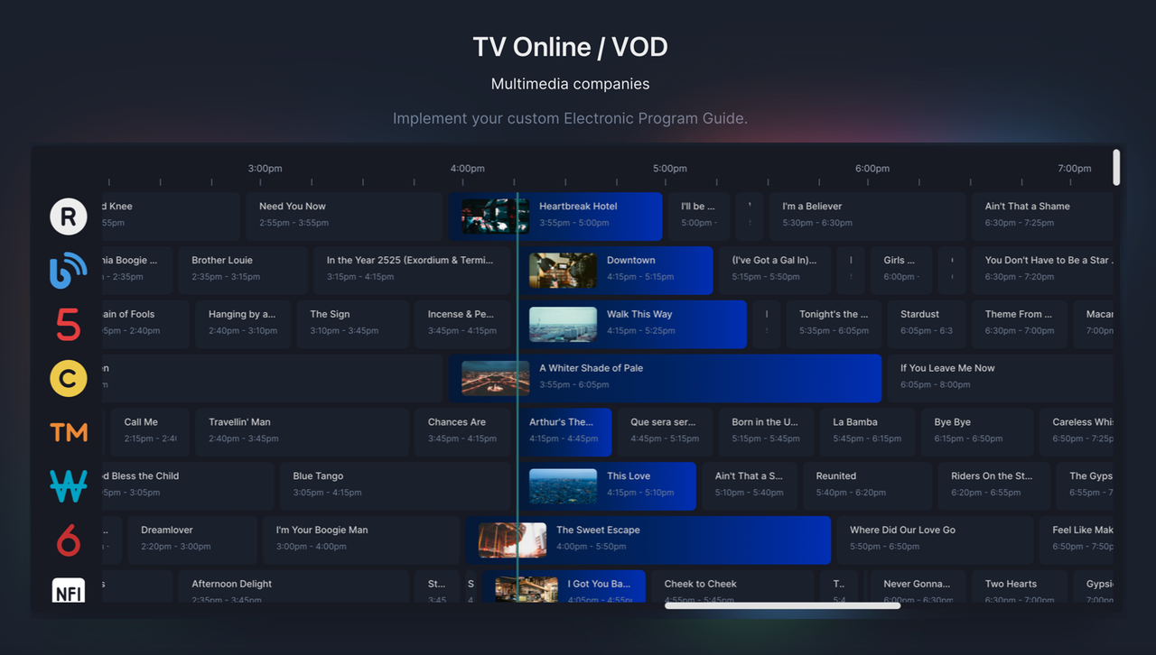
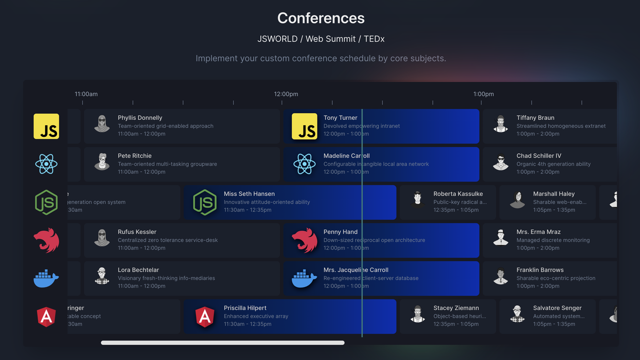
A React based component for a quick implementation of Epg, schedules, live ...
README


Description
Planby is a React based component for a quick implementation of Epg, schedules, live streaming, music events, timelines and many more ideas. It uses a custom virtual view which allows you to operate on a really big number of data. The component has a simple API that you can easily integrate with other third party UI libraries. The component theme is customised to the needs of the application design.

Codesandbox example
Testimonials
We added Planby as the EPG component of the JWP open-source OTT web app . The JWP Web App enables developers to quickly build OTT Apps for web platforms, and using Planby developers can easily visualize schedules for 24x7 live streams in their OTT Apps.
Marco van de Veen

**Product Manager**
JW Player
Support our activity and help us continue our development -> Open Collective.
Getting Started
Installation
- yarn
- ```sh
- yarn add planby
- ```
- npm
- ```sh
- npm install planby
- ```
Usage
- ```tsx
- import { useEpg, Epg, Layout } from 'planby';
- const channels = React.useMemo(
- () => [
- {
- logo: 'https://via.placeholder.com',
- uuid: '10339a4b-7c48-40ab-abad-f3bcaf95d9fa',
- ...
- },
- ],
- []
- );
- const epg = React.useMemo(
- () => [
- {
- channelUuid: '30f5ff1c-1346-480a-8047-a999dd908c1e',
- description:
- 'Ut anim nisi consequat minim deserunt...',
- id: 'b67ccaa3-3dd2-4121-8256-33dbddc7f0e6',
- image: 'https://via.placeholder.com',
- since: "2022-02-02T23:50:00",
- till: "2022-02-02T00:55:00",
- title: 'Title',
- ...
- },
- ],
- []
- );
- const {
- getEpgProps,
- getLayoutProps,
- onScrollToNow,
- onScrollLeft,
- onScrollRight,
- } = useEpg({
- epg,
- channels,
- startDate: '2022/02/02', // or 2022-02-02T00:00:00
- });
- return (
- <div>
- <div style={{ height: '600px', width: '1200px' }}>
- <Epg {...getEpgProps()}>
- <Layout
- {...getLayoutProps()}
- />
- </Epg>
- </div>
- </div>
- );
- ```
or
Custom width and height
- ```tsx
- const {
- getEpgProps,
- getLayoutProps,
- ...
- } = useEpg({
- epg,
- channels,
- startDate: '2022/02/02', // or 2022-02-02T00:00:00
- width: 1200,
- height: 600
- });
- return (
- <div>
- <Epg {...getEpgProps()}>
- <Layout
- {...getLayoutProps()}
- />
- </Epg>
- </div>
- ```
or
Time range
- ```tsx
- const {
- getEpgProps,
- getLayoutProps,
- ...
- } = useEpg({
- epg,
- channels,
- startDate: '2022-02-02T10:00:00',
- endDate: '2022-02-02T20:00:00',
- width: 1200,
- height: 600
- });
- return (
- <div>
- <Epg {...getEpgProps()}>
- <Layout
- {...getLayoutProps()}
- />
- </Epg>
- </div>
- ```
API
useEpg
Options
Available options in useEpg
| Property | Type | Status | Description |
|---|---|---|---|
| ------------------ | --------- | -------- | ---------------------------------------------------------------------------------------------------------------------------------------------------------------- |
| `channels` | `array` | required | Array |
| `epg` | `array` | required | Array |
| `width` | `number` | optional | Epg |
| `height` | `number` | optional | Epg |
| `sidebarWidth` | `number` | optional | Width |
| `itemHeight` | `number` | optional | Height |
| `dayWidth` | `number` | optional | Width |
| `startDate` | `string` | optional | Date |
| `endtDate` | `string` | optional | Date |
| `isBaseTimeFormat` | `boolean` | optional | Convert |
| `isSidebar` | `boolean` | optional | Show/hide |
| `isTimeline` | `boolean` | optional | Show/hide |
| `isLine` | `boolean` | optional | Show/hide |
| `isRTL` | `boolean` | optional | Change |
| `theme` | `object` | optional | Object |
| `globalStyles` | `string` | optional | Inject |
Note about width and height props
Without declaring the width and length properties, the component takes the dimensions of the parent element.
globalStyles
Inject own custom font and other global styles.
- ```tsx
- const globalStyles = `
- @import url("https://fonts.googleapis.com/css2?family=Inter:wght@400;500;600&display=swap");
- .planby {
- font-family: "Inter", system-ui, -apple-system,
- "Segoe UI", Roboto, Helvetica, Arial, sans-serif,
- "Apple Color Emoji", "Segoe UI Emoji";
- }
- // Other styles
- ...
- `;
- ```
Instance Properties
Properties returned from useEpg
| Property | Type | Description |
|---|---|---|
| --------------- | ------------------------- | ------------------------------------ |
| `scrollY` | `number` | Current |
| `scrollX` | `number` | Current |
| `onScrollLeft` | `function(value: | Default |
| `onScrollRight` | `function(value: | Default |
| `onScrollToNow` | `function()` | Scroll |
| `onScrollTop` | `function(value: | Default |
Channel schema
| Property | Type | Status |
|---|---|---|
| -------- | -------- | -------- |
| `logo` | `string` | required |
| `uuid` | `string` | required |
Epg schema
| Property | Type | Status |
|---|---|---|
| ------------- | -------- | -------- |
| `channelUuid` | `string` | required |
| `id` | `string` | required |
| `image` | `string` | required |
| `since` | `string` | required |
| `till` | `string` | required |
| `title` | `string` | required |
Epg
Base props
Available props in Epg
| Property | Type | Description | Status |
|---|---|---|---|
| ----------- | ----------- | ------------------------ | -------- |
| `isLoading` | `boolean` | Loader | optional |
| `loader` | `Component` | Loader | optional |
Layout
Base props
Available props in Layout.
| Property | Type | Description | Status |
|---|---|---|---|
| ---------------- | -------------------------------------------------------- | --------------------------------------------------------------------------------------------------------------- | -------- |
| `renderProgram` | `function({ | `data` | optional |
| `renderChannel` | `function({ | `channel` | optional |
| `renderTimeline` | `function({sidebarWidth: | `sidebarWidth` | optional |
Render functions
You can use Plaby's style components to develop main features. Moreover, you can integrate with third party UI library eg. Chakra UI, Material UI etc or make custom styles.
renderProgram
Below is an example that allows you to render your custom Program component using Plaby's style components.
- ```tsx
- import {
- useEpg,
- Epg,
- Layout,
- ProgramBox,
- ProgramContent,
- ProgramFlex,
- ProgramStack,
- ProgramTitle,
- ProgramText,
- ProgramImage,
- useProgram,
- Program,
- ProgramItem
- } from "planby";
- const Item = ({ program,...rest }: ProgramItem) => {
- const { styles, formatTime, isLive, isMinWidth } = useProgram({ program,...rest });
- const { data } = program;
- const { image, title, since, till } = data;
- const sinceTime = formatTime(since);
- const tillTime = formatTime(till);
- return (
- <ProgramBox width={styles.width} style={styles.position}>
- <ProgramContent
- width={styles.width}
- isLive={isLive}
- >
- <ProgramFlex>
- {isLive && isMinWidth && <ProgramImage src={image} alt="Preview" />}
- <ProgramStack>
- <ProgramTitle>{title}</ProgramTitle>
- <ProgramText>
- {sinceTime} - {tillTime}
- </ProgramText>
- </ProgramStack>
- </ProgramFlex>
- </ProgramContent>
- </ProgramBox>
- );
- };
- function App() {
- ...
- const {
- getEpgProps,
- getLayoutProps,
- } = useEpg({
- epg,
- channels,
- startDate: '2022/02/02', // or 2022-02-02T00:00:00
- });
- return (
- <div>
- <div style={{ height: '600px', width: '1200px' }}>
- <Epg {...getEpgProps()}>
- <Layout
- {...getLayoutProps()}
- renderProgram={({ program,...rest }) => (
- <Item key={program.data.id} program={program} {...rest} />
- )}
- />
- </Epg>
- </div>
- </div>
- );
- }
- export default App;
- ```
renderProgram - 12 hours time format
Below is an example that allows you to render your custom Program component with 12 hours time format using Plaby's style components.
- ```tsx
- ...
- const Item = ({ program, ...rest }: ProgramItem) => {
- const {
- styles,
- formatTime,
- set12HoursTimeFormat,
- isLive,
- isMinWidth,
- } = useProgram({
- program,
- ...rest
- });
- const { data } = program;
- const { image, title, since, till } = data;
- const sinceTime = formatTime(since, set12HoursTimeFormat()).toLowerCase();
- const tillTime = formatTime(till, set12HoursTimeFormat()).toLowerCase();
- return (
- <ProgramBox width={styles.width} style={styles.position}>
- <ProgramContent
- width={styles.width}
- isLive={isLive}
- >
- <ProgramFlex>
- {isLive && isMinWidth && <ProgramImage src={image} alt="Preview" />}
- <ProgramStack>
- <ProgramTitle>{title}</ProgramTitle>
- <ProgramText>
- {sinceTime} - {tillTime}
- </ProgramText>
- </ProgramStack>
- </ProgramFlex>
- </ProgramContent>
- </ProgramBox>
- );
- };
- function App() {
- ...
- const {
- getEpgProps,
- getLayoutProps,
- } = useEpg({
- epg,
- channels,
- isBaseTimeFormat: true,
- startDate: '2022/02/02', // or 2022-02-02T00:00:00
- });
- ...
- }
- export default App;
- ```
renderProgram - RTL direction
Below is an example that allows you to render your custom Program component with RTL direction using Plaby's style components.
- ```tsx
- ...
- const Item = ({ program, ...rest }: ProgramItem) => {
- const {
- isRTL,
- isLive,
- isMinWidth,
- formatTime,
- styles,
- set12HoursTimeFormat,
- getRTLSinceTime,
- getRTLTillTime,
- } = useProgram({
- program,
- ...rest
- });
- const { data } = program;
- const { image, title, since, till } = data;
- const sinceTime = formatTime(
- getRTLSinceTime(since),
- set12HoursTimeFormat()
- ).toLowerCase();
- const tillTime = formatTime(
- getRTLTillTime(till),
- set12HoursTimeFormat()
- ).toLowerCase();
- return (
- <ProgramBox width={styles.width} style={styles.position}>
- <ProgramContent width={styles.width} isLive={isLive}>
- <ProgramFlex>
- {isLive && isMinWidth && <ProgramImage src={image} alt="Preview" />}
- <ProgramStack isRTL={isRTL}>
- <ProgramTitle>{title}</ProgramTitle>
- <ProgramText>
- {sinceTime} - {tillTime}
- </ProgramText>
- </ProgramStack>
- </ProgramFlex>
- </ProgramContent>
- </ProgramBox>
- );
- };
- function App() {
- ...
- const {
- getEpgProps,
- getLayoutProps,
- } = useEpg({
- epg,
- channels,
- isBaseTimeFormat: true,
- startDate: '2022/02/02', // or 2022-02-02T00:00:00
- });
- ...
- }
- export default App;
- ```
renderChannel
Below is an example that allows you to render your custom Channel component using Plaby's style components.
- ```tsx
- import { useEpg, Epg, Layout, ChannelBox, ChannelLogo, Channel } from 'planby';
- interface ChannelItemProps {
- channel: Channel;
- }
- const ChannelItem = ({ channel }: ChannelItemProps) => {
- const { position, logo } = channel;
- return (
- <ChannelBox {...position}>
- <ChannelLogo
- onClick={() => console.log('channel', channel)}
- src={logo}
- alt="Logo"
- />
- </ChannelBox>
- );
- };
- function App() {
- ...
- const {
- getEpgProps,
- getLayoutProps,
- } = useEpg({
- epg,
- channels,
- startDate: '2022/02/02', // or 2022-02-02T00:00:00
- });
- return (
- <div>
- <div style={{ height: '600px', width: '1200px' }}>
- <Epg {...getEpgProps()}>
- <Layout
- {...getLayoutProps()}
- renderChannel={({ channel }) => (
- <ChannelItem key={channel.uuid} channel={channel} />
- )}
- />
- </Epg>
- </div>
- </div>
- );
- }
- ```
renderTimeline
Below is an example that allows you to render your custom Timeline component using Plaby's style components.
- ```tsx
- import {
- TimelineWrapper,
- TimelineBox,
- TimelineTime,
- TimelineDivider,
- TimelineDividers,
- useTimeline,
- } from 'planby';
- interface TimelineProps {
- isBaseTimeFormat: boolean;
- isSidebar: boolean;
- dayWidth: number;
- hourWidth: number;
- numberOfHoursInDay: number;
- offsetStartHoursRange: number;
- sidebarWidth: number;
- }
- export function Timeline({
- isBaseTimeFormat,
- isSidebar,
- dayWidth,
- hourWidth,
- numberOfHoursInDay,
- offsetStartHoursRange,
- sidebarWidth,
- }: TimelineProps) {
- const { time, dividers, formatTime } = useTimeline(
- numberOfHoursInDay,
- isBaseTimeFormat
- );
- const renderTime = (index: number) => (
- <TimelineBox key={index} width={hourWidth}>
- <TimelineTime>
- {formatTime(index + offsetStartHoursRange).toLowerCase()}
- </TimelineTime>
- <TimelineDividers>{renderDividers()}</TimelineDividers>
- </TimelineBox>
- );
- const renderDividers = () =>
- dividers.map((_, index) => (
- <TimelineDivider key={index} width={hourWidth} />
- ));
- return (
- <TimelineWrapper
- dayWidth={dayWidth}
- sidebarWidth={sidebarWidth}
- isSidebar={isSidebar}
- >
- {time.map((_, index) => renderTime(index))}
- </TimelineWrapper>
- );
- }
- function App() {
- ...
- const {
- getEpgProps,
- getLayoutProps,
- } = useEpg({
- epg,
- channels,
- startDate: '2022/02/02', // or 2022-02-02T00:00:00
- });
- return (
- <div>
- <div style={{ height: '600px', width: '1200px' }}>
- <Epg {...getEpgProps()}>
- <Layout
- {...getLayoutProps()}
- renderTimeline={(props) => <Timeline {...props} />}
- />
- </Epg>
- </div>
- </div>
- );
- }
- export default App;
- ```
renderTimeline - RTL direction
Below is an example that allows you to render your custom Timeline component using Plaby's style components.
- ```tsx
- import {
- TimelineWrapper,
- TimelineBox,
- TimelineTime,
- TimelineDivider,
- TimelineDividers,
- useTimeline,
- } from 'planby';
- interface TimelineProps {
- isRTL: boolean;
- isBaseTimeFormat: boolean;
- isSidebar: boolean;
- dayWidth: number;
- hourWidth: number;
- numberOfHoursInDay: number;
- offsetStartHoursRange: number;
- sidebarWidth: number;
- }
- export function Timeline({
- isRTL,
- isBaseTimeFormat,
- isSidebar,
- dayWidth,
- hourWidth,
- numberOfHoursInDay,
- offsetStartHoursRange,
- sidebarWidth,
- }: TimelineProps) {
- const { time, dividers, formatTime } = useTimeline(
- numberOfHoursInDay,
- isBaseTimeFormat
- );
- const renderTime = (index: number) => (
- <TimelineBox key={index} width={hourWidth}>
- <TimelineTime isBaseTimeFormat={isBaseTimeFormat} isRTL={isRTL}>
- {formatTime(index + offsetStartHoursRange).toLowerCase()}
- </TimelineTime>
- <TimelineDividers>{renderDividers()}</TimelineDividers>
- </TimelineBox>
- );
- ...
- }
- ```
Theme
Schema
Make your theme custom. Below is theme schema that you can pass as one of the options to useEpg hook.
- ``` js
- const theme = {
- primary: {
- 600: '#1a202c',
- 900: '#171923',
- },
- grey: { 300: '#d1d1d1' },
- white: '#fff',
- green: {
- 300: '#2C7A7B',
- },
- loader: {
- teal: '#5DDADB',
- purple: '#3437A2',
- pink: '#F78EB6',
- bg: '#171923db',
- },
- scrollbar: {
- border: '#ffffff',
- thumb: {
- bg: '#e1e1e1',
- },
- },
- gradient: {
- blue: {
- 300: '#002eb3',
- 600: '#002360',
- 900: '#051937',
- },
- },
- text: {
- grey: {
- 300: '#a0aec0',
- 500: '#718096',
- },
- },
- timeline: {
- divider: {
- bg: '#718096',
- },
- },
- };
- ```
All import options
- ```tsx
- import {
- Epg,
- Layout,
- ChannelBox,
- ChannelLogo,
- ProgramBox,
- ProgramContent,
- ProgramFlex,
- ProgramStack,
- ProgramTitle,
- ProgramText,
- ProgramImage,
- TimelineWrapper,
- TimelineBox,
- TimelineTime,
- TimelineDividers,
- useEpg,
- useProgram,
- useTimeline,
- Program, // Interface
- Channel, // Interface
- ProgramItem, // Interface for program render
- Theme, // Interface
- } from 'planby';
- ```
License
Distributed under the MIT License. See LICENSE for more information.
Contact
Karol Kozer - @kozerkarol_twitter
Project Link: https://github.com/karolkozer/planby
