 探客时代
探客时代

react-ts-form
Build maintainable, typesafe forms faster
README

Build maintainable, typesafe forms faster 🏃💨
@ts-react/form handles the boilerplate involved when building forms using zod and react-hook-form without sacrificing customizability.
Features
- 🥹 Automatically generate typesafe forms with zod schemas
- 📎 Eliminate repetitive jsx and zod/rhf boilerplate
- 🎮 Full control of components via typesafe props
- 🤯 Headless UI that can render any react component
- 🤌🏻 Very tiny utility library (~3kb gzipped)
- 👀 Great test coverage
Quick Start
Installation
Make sure you have "strict": true in your tsconfig.json compilerOptions and make sure you set your editors typescript version to v4.9 (or intellisense won't be as reliable).
Install package and dependencies with your preferred package manager:
- ```sh
- yarn add @ts-react/form
- # required peer dependencies
- yarn add zod react-hook-form @hookform/resolvers
- ```
Usage
Create a zod-to-component mapping to map zod schemas to your components then create your form with createTsForm (typically once per project):
- ```tsx
- // create the mapping
- const mapping = [
- [z.string(), TextField],
- [z.boolean(), CheckBoxField],
- [z.number(), NumberField],
- ] as const; // 👈 `as const` is necessary
- // A typesafe React component
- const MyForm = createTsForm(mapping);
- ```
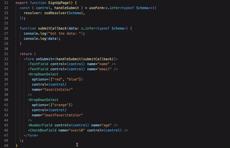
Now just create form schemas with zod and pass them to your form:
- ```tsx
- const SignUpSchema = z.object({
- email: z.string().email("Enter a real email please."), // renders TextField
- password: z.string(),
- address: z.string(),
- favoriteColor: z.enum(["blue", "red", "purple"]), // renders DropDownSelect and passed the enum values
- isOver18: z.boolean(), // renders CheckBoxField
- });
- function MyPage() {
- function onSubmit(data: z.infer<typeof SignUpSchema>) {
- // gets typesafe data when form is submitted
- }
- return (
- <MyForm
- schema={SignUpSchema}
- onSubmit={onSubmit}
- renderAfter={() => <button type="submit">Submit</button>}
- // optional typesafe props forwarded to your components
- props={{
- email: {
- className: "mt-2",
- },
- }}
- />
- );
- }
- ```
That's it! Adding a new field to your form just means adding an additional property to the schema.
It's recommended but not required that you create a custom form component to handle repetitive stuff (like rendering the submit button).
Creating Input Components
Form components can be any react component. The useTsController() hook allows you to build your components with the form state:
- ```tsx
- function TextField() {
- const { field, error } = useTsController<string>();
- return (
- <>
- <input
- value={field.value ? field.value : ""} // conditional to prevent "uncontrolled to controlled" react warning
- onChange={(e) => {
- field.onChange(e.target.value);
- }}
- />
- {error?.errorMessage && <span>{error?.errorMessage}</span>}
- </>
- );
- }
- ```
@ts-react/form will magically connecting your component to the appropriate field with this hook. You can also receive the control and name as props, if you prefer:
- ```tsx
- function TextField({ control, name }: { control: Control<any>; name: string }) {
- const { field, fieldState } = useController({ name, control });
- //...
- }
- ```
This approach is less typesafe than useTsController.
If you want the control, name, or other @ts-react/form data to be passed to props with a different name check out prop forwarding.
Docs
1. Quick Start
11. Default Values
12. Prop Forwarding
TypeSafe Props
Based on your component mapping, @ts-react/form knows which field should receive which props:
- ```tsx
- const mapping = [
- [z.string(), TextField] as const,
- [z.boolean(), CheckBoxField] as const,
- ] as const;
- //...
- const Schema = z.object({
- name: z.string(),
- password: z.string(),
- over18: z.boolean(),
- })
- //...
- <MyForm
- props={{
- name: {
- // TextField props
- },
- over18: {
- // CheckBoxField props
- }
- }}
- />
- ```
@ts-react/form is also aware of which props are required, so it will make sure you always pass required props to your components:

- ```tsx
- return (
- <Form
- schema={FormSchema}
- onSubmit={() => {}}
- props={{
- field: {
- required: "Fixed!",
- },
- }}
- />
- );
- ```
Fixed! We get all the same typesafety of writing out the full jsx.
Error Handling
It's important to always display errors to your users when validation fails.
Accessing Error Messages in your component
@ts-react/form also returns an error object that's more accurately typed than react-hook-forms's that you can use to show errors:
- ```tsx
- function MyComponent() {
- const { error } = useTsController<string>();
- return (
- <div>
- // ...
- // Normally we conditionally render error messages
- {error && <span>{error.errorMessage}</span>}
- </div>
- )
- }
- ```
Writing error messages
Zod schemas make it very easy to create validation steps for your form while also providing an easy way to pass error messages when those steps fail:
- ```tsx
- z.object({
- email: z.string().email("Invalid email"),
- password: z.string()
- .min(1, "Please enter a password.")
- .min(8, "Your password must be at least 8 characters in length")
- )}
- ```
In the above schema, the email field is validated as an email because we've called .email() on the string schema, the message "Invalid email" will be put into the form state if the user tries to submit. To learn more about the different types of validations you can perform you should consult the zod documentation (since zod schemas are what generates the errors for this library).
Revalidation
The default behavior for this library is that errors will be shown once the user tries to submit, and fields will be revalidated as the value changes (as soon as the user enters a valid email the error message dissapears). Generally this works well but you may want to use some other validation behavior. Check out the react hook form docs and pass a customuseForm to your forms form prop:
- ```tsx
- const form = useForm<z.infer<typeof MyFormSchema>>({
- resolver: zodResolver(MyFormSchema),
- revalidateMode: "onSubmit" // now the form revalidates on submit
- });
- return (
- <Form
- //...
- form={form}
- />
- )
- ```
For more information about dealing with errors (IE imperatively resetiting errors), check out the hook form docs
Dealing with collisions
Some times you want multiple types of for the same zod schema type. You can deal with collisions using createUniqueFieldSchema:
- ```tsx
- const MyUniqueFieldSchema = createUniqueFieldSchema(
- z.string(),
- "aUniqueId" // You need to pass a string ID, it can be anything but has to be set explicitly and be unique.
- );
- const mapping = [
- [z.string(), NormalTextField] as const,
- [MyUniqueFieldSchema, UltraTextField] as const,
- ] as const;
- const MyFormSchema = z.object({
- mapsToNormal: z.string(), // renders as a NormalTextField component
- mapsToUnique: MyUniqueTextFieldSchema, // renders as a UltraTextField component.
- });
- ```
Handling Optionals
@ts-react/form will match optionals to their non optional zod schemas:
- ```tsx
- const mapping = [[z.string(), TextField]] as const;
- const FormSchema = z.object({
- optionalEmail: z.string().email().optional(), // renders to TextField
- nullishZipCode: z.string().min(5, "5 chars please").nullish(), // renders to TextField
- });
- ```
Your zod-component-mapping should not include any optionals. If you want a reusable optional schema, you can do something like this:
- ```tsx
- const mapping = [[z.string(), TextField]] as const;
- export const OptionalTextField = z.string().optional();
- ```
Accessing useForm state
Sometimes you need to work with the form directly (such as to reset the form from the parent). In these cases, just pass the react-hook-form useForm() result to your form:
- ```tsx
- function MyPage() {
- // Need to type the useForm call accordingly
- const form = useForm<z.infer<typeof FormSchema>>();
- const { reset } = form;
- return (
- <Form
- form={form}
- schema={FormSchema}
- // ...
- />
- );
- }
- ```
Complex field types
You can use most any zod schema and have it map to an appropriate component:
- ```tsx
- function AddressEntryField() {
- const {field: {onChange, value}, error} = useTsController<z.infer<typeof AddressSchema>>();
- const street = value?.street;
- const zipCode = value?.zipCode;
- return (
- <div>
- <input
- value={street}
- onChange={(e)=>{
- onChange({
- ...value,
- street: e.target.value,
- })
- })
- />
- {error?.street && <span>{error.street.errorMessage}</span>}
- <input
- value={zipCode}
- onChange={(e)=>{
- onChange({
- ...value,
- zipCode: e.target.value
- })
- }}
- />
- {error?.zipCode && <span>{error.zipCode.errorMessage}</span>}
- </div>
- )
- }
- const AddressSchema = z.object({
- street: z.string(),
- zipCode: z.string(),
- });
- const mapping = [
- [z.string, TextField] as const,
- [AddressSchema, AddressEntryField] as const,
- ] as const;
- const FormSchema = z.object({
- name: z.string(),
- address: AddressSchema, // renders as AddressInputComponent
- });
- ```
This allows you to build stuff like this when your designer decides to go crazy:

Adding non input components into your form
Some times you need to render components in between your fields (maybe a form section header). In those cases there are some extra props that you can pass to your fields beforeElement or afterElement which will render a ReactNode before or after the field:
- ```tsx
- <MyForm
- schema={z.object({
- field: z.string(),
- })}
- props={{
- field: {
- beforeElement: <span>Renders Before The Input</span>,
- afterElement: <span>Renders After The Input</span>,
- },
- }}
- />
- ```
Customizing form components
By default your form is just rendered with a "form" tag. You can pass props to it via formProps:
- ```tsx
- <MyForm
- formProps={{
- ariaLabel: "label",
- }}
- />
- ```
You can also provide a custom form component as the second parameter to createTsForm options if you want, it will get passed an onSubmit function, and it should also render its children some where:
- ```tsx
- const mapping = [
- //...
- ] as const
- function MyCustomFormComponent({
- children,
- onSubmit,
- aThirdProp,
- }:{
- children: ReactNode,
- onSubmit: ()=>void,
- aThirdProp: string,
- }) {
- return (
- <form onSubmit={onSubmit}>
- <img src={"https://picsum.photos/200"} className="w-4 h-4">
- {/* children is you form field components */}
- {children}
- <button type="submit">submit</button>
- </form>
- )
- }
- // MyCustomFormComponent is now being used as the container instead of the default "form" tag.
- const MyForm = createTsForm(mapping, {FormComponent: MyCustomFormComponent});
- <MyForm
- formProps={{
- // formProps is typesafe to your form component's props (and will be required if there is
- // required prop).
- aThirdProp: "prop"
- }}
- />
- ```
Manual Form Submission
The default form component as well as a custom form component (if used) will automatically be passed the onSubmit function.
Normally, you'll want to pass a button to the renderAfter or renderBefore prop of the form:
- ```tsx
- <MyForm renderAfter={() => <button type="submit">Submit</button>} />
- ```
For React Native, or for other reasons, you will need to call submit explicitly:
- ```tsx
- <MyForm
- renderAfter={({ submit }) => (
- <TouchableOpacity onPress={submit}>
- <Text>Submit</Text>
- </TouchableOpacity>
- )}
- />
- ```
React Native Usage
For now React Native will require you to provide your own custom form component. The simplest way to do it would be like:
- ```tsx
- const FormContainer = ({ children }: { children: ReactNode }) => (
- <View>{children}</View>
- );
- const mapping = [
- //...
- ] as const;
- const MyForm = createTsForm(mapping, { FormComponent: FormContainer });
- ```
Default values
You can provide typesafe default values like this:
- ```tsx
- const Schema = z.object({
- string: z.string(),
- num: z.number()
- })
- //...
- <MyForm
- schema={Schema}
- defaultValues={{
- string: 'default',
- num: 5
- }}
- />
- ```
Prop Forwarding
Prop forwarding is an advanced feature that allows you to control which props @ts-react/form forward to your components as well as the name.
You probably don't need to use this especially when building a project from scratch, but it can allow more customization. This can be useful for integrating with existing components, or for creating a selection of components that can be used both with and without @ts-react/form.
For example, if I wanted the react hook form control to be forwarded to a prop named floob I would do:
- ```tsx
- const propsMap = [
- ["control", "floob"] as const,
- ["name", "name"] as const,
- ] as const;
- function TextField({ floob, name }: { floob: Control<any>; name: string }) {
- const { field, fieldState } = useController({ name, control: floob });
- }
- const componentMap = [[z.string(), TextField] as const] as const;
- const MyForm = createTsForm(componentMap, {
- propsMap: propsMap,
- });
- ```
Props that are included in the props map will no longer be passable via the props prop of the form. So if you don't want to forward any props to your components (and prefer just using hooks), you can pass an empty array. _Any data that's not included in the props map will no longer be passed to your components_
❤️ Quality of Life / Productivity ❤️
These allow you to build forms even faster by connecting zod schemas directly to react state. These features are opt-in, it's possible to do the things in this section via props but these approaches may be faster / easier.
Quick Labels / Placeholders
@ts-react/form provides a way to quickly add labels / placeholders via zod's .describe() method:
- ```tsx
- const FormSchema = z.object({
- // label="Field One", placeholder="Please enter field one...."
- fieldOne: z.string().describe("Field One // Please enter field one..."),
- });
- ```
The // syntax separates the label and placeholder. @ts-react/form will make these available via the useDescription() hook:
- ```ts
- function TextField() {
- const { label, placeholder } = useDescription();
- return (
- <>
- <label>{label}</label>
- <input placeholder={placeholder} />
- </>
- );
- }
- ```
This is just a quicker way to pass labels / placeholders, but it also allows you to reuse placeholder / labels easily across forms:
- ```tsx
- const MyTextFieldWithLabel = z.string().describe("label");
- const FormSchemaOne = z.object({
- field: MyTextFieldWithLabel,
- });
- const FormSchemaTwo = z.object({
- field: MyTextFieldWithLabel,
- });
- ```
If you prefer, you can just pass label and placeholder as normal props via props.
TypeScript versions
Older versions of typescript have worse intellisense and may not show an error in your editor. Make sure your editors typescript version is set to v4.9 plus. The easiest approach is to upgrade your typescript globally if you haven't recently:
- ```sh
- sudo npm -g upgrade typescript
- ```
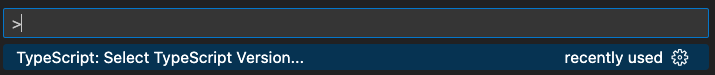
Or, in VSCode you can do (Command + Shift + P) and search for "Select Typescript Version" to change your editors Typescript Version:
Note that you can still compile with older versions of typescript and the type checking will work.
Limitations
- Doesn't support class components
- @ts-react/form allows you to pass props to your components and render elements in between your components, which is good for almost all form designs out there. Some designs may not be easily achievable. For example, if you need a container around multiple sections of your form, this library doesn't allow splitting child components into containers at the moment. (Though if it's a common-enough use case and you'd like to see it added, open an issue!)
