 探客时代
探客时代

DecaUI
DecaUI is production-ready themeable component library built with StitchesJ...
README
DecaUI


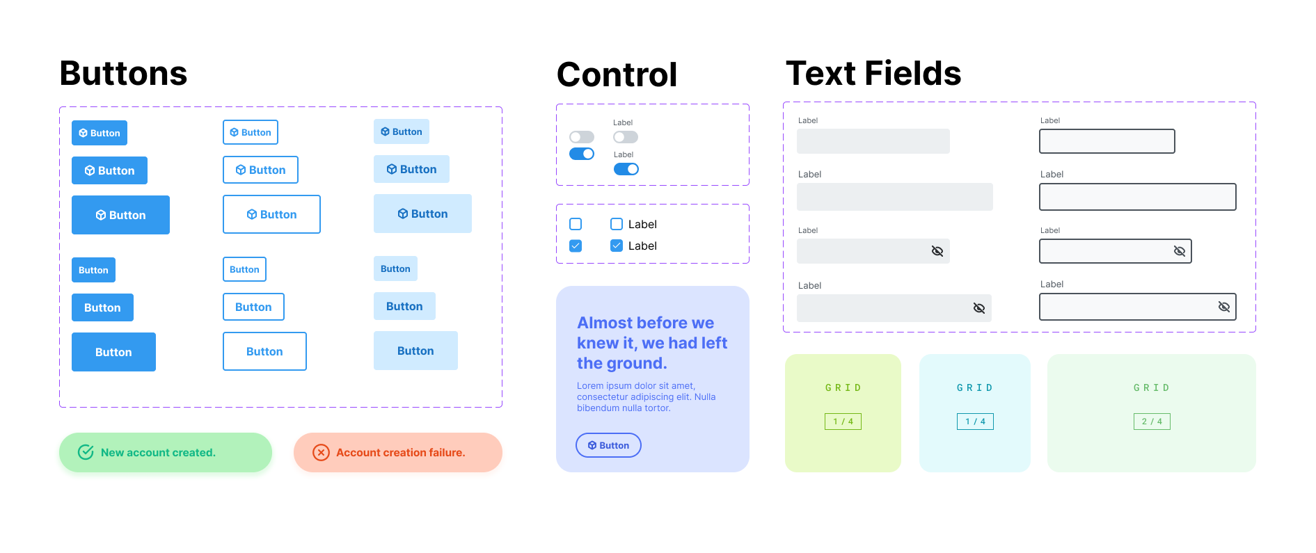
DecaUI provides a set of accessible and customizable React components that make it easy to quickly prototype and develop stunning websites.
Warning
DecaUI is in beta and is being actively developed.
Getting Started
- ```
- npm install @deca-ui/react
- ```
Using a component
Here is a simple example of a basic app using DecaUI's Button component
- ```jsx
- import { Button } from '@deca-ui/react';
- function App() {
- return <Button variant="solid">Hello World</Button>;
- }
- ```
What's so different about DecaUI
With DecaUI, developers can use the centralized theming system anywhere within their application with shorthand names for css properties.
Custom CSS with other UI libraries
- ```jsx
- <Box
- sx={{
- marginRight: '2rem',
- marginLeft: '2rem',
- marginTop: '2rem',
- marginBottom: '2rem',
- }}
- >
- <Input placeholder="Email Address" />
- <Input placeholder="Password" />
- <Button
- sx={{
- width: '100%',
- }}
- >
- Create Account
- </Button>
- </Box>
- ```
Custom CSS with DecaUI
- ```jsx
- <Box css={{ m: '$3' }}>
- <Input placeholder="Email Address" />
- <Input placeholder="Password" />
- <Button maxWidth>Create Account</Button>
- </Box>
- ```
Our focus is consistency
The main problem with other UI libraries is that it's confusing to create consistent webpage layouts with them. DecaUI allows developers to utilize a root theme object which serves properties following the System UI specification.
License
Thank you
