 探客时代
探客时代

ascii-progress
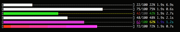
Ascii progress-bar(s) in the terminal.
README
ascii-progress
Ascii progress-bar(s) in the terminal.

Features:
- Support multi progress-bars.
- Relative and absolute width.
- Colorful bar and text.
- Highly customizable.
Install
- ```
- $ npm install ascii-progress
- ```
Usage
For more usage see the examples
- ```javascript
- const { ProgressBar } = require('ascii-progress');
- const bar = new ProgressBar({
- schema: ':bar',
- total : 10,
- });
- const iv = setInterval(function () {
- bar.tick();
- if (bar.completed) {
- clearInterval(iv);
- }
- }, 100);
- ```
Options
These are keys in the options object you can pass to the progress bar along with total as seen in the example above.
- schema - template string of the progress bar. Default " [:bar] :current/:total :percent :elapseds :etas'".
- total - total number of ticks to complete. Default 100.
- current- number of completed ticks. Default 0.
- width - display width, percentage or less than 1 is relative the terminal's width. Default 60.
- fixedWidth - do not adjust the bar based on the terminal size
- filled- completion character. Default "▇".
- blank - blank character. Default "-".
- clean - clear the progress bar on completion. Default false.
- callback - optional function to call when the progress bar completes.
Properties
- schema
- total
- current
- completed
Methods
- setSchema(schema, refresh/tokens) - Update the schema of the progress bar. If refresh or tokens is truely the progress bar will be refreshed.
- tick(delta, tokens) - Update ticks of the progress bar by delta, then render the progress bar with optional tokens.
- update(ratio, tokens) - Update the progress bar to ratio by percentage, then render the progress bar with optional tokens.
- clear() - Clean the progress bar in the terminal.
Schema
The schema defines appearance the progress bar. Few inner tokens and many formatting methods can be used to customer you progress bar.
Tokens
These are tokens you can use in the format of your progress bar.
- :filled Completed part of the progress bar.
- :blank Blank part of the progress bar.
- :bar Whole progress bar, equal to :completed:blank.
- :current Current tick number.
- :total Total ticks.
- :percent Completion percentage.
- :elapsed Time elapsed in seconds.
- :eta Estimated completion time in seconds.
Custom Tokens
You can define custom tokens by adding a {name: value} object parameter to your method (tick(), update(), etc.) calls.
- ```javascript
- const bar = new ProgressBar({
- schema: ':current: :token1 :token2',
- total : 3,
- });
- bar.tick({
- 'token1': "Hello",
- 'token2': "World!"
- })
- bar.tick(2, {
- 'token1': "Goodbye",
- 'token2': "World!"
- })
- ```
The above example would result in the output below.
- ```
- 1: Hello World!
- 3: Goodbye World!
- ```
Colors
Color names can be use in schema:
- ```
- :bar.red :percent.green
- ```
Then the progress bar will be red, and the percentage will be green.
All available color names:
- red
- cyan
- blue
- grey
- white
- black
- green
- yellow
- magenta
- brightRed
- brightBlue
- brightCyan
- brightWhite
- brightBlack
- brightGreen
- brightYellow
- brightMagenta
And with the bg prefix, such as bgRed, the color will be applied to the background.
- ```
- :bar.red.bgBlue
- ```
The above progress bar has blue background and red foreground.
Gradient
- ```
- :bar.gradient(red,blue)
- ```
The arguments can be color names or hex color:
- red
- cyan
- blue
- grey
- white
- black
- green
- yellow
- magenta
- \#xxxxxx
Font style
Same as color names, font style can also be assigned by name:
- bold
- italic
- inverse
- underline
- ```
- :bar.red :percent.green.bold
- ```
The percentage is green and bold.
Contributing
Please let us know how can we help. Do check out issues for bug reports or suggestions first.
To become a contributor, please follow our contributing guide.

License
The scripts and documentation in this project are released under the MIT License
