 探客时代
探客时代

Algolia Autocomplete.js
Fast and full-featured autocomplete library
README
⚠️ Deprecation notice
>
Autocomplete.js (v0.x) is deprecated and no longer supported. Please use Autocomplete instead.
To upgrade from v0.x, please follow our upgrade guide.
Autocomplete.js
This JavaScript library adds a fast and fully-featured auto-completion menu to your search box displaying results "as you type". It can easily be combined with Algolia's realtime search engine. The library is available as a jQuery plugin, an Angular.js directive or a standalone library.


Table of Contents
- Features
- jsDelivr
- cdnjs
- npm
- Bower
- Usage
- jQuery
- Datasets
- Sources
- Hits
- Security
- FAQ
- [How can I Control-click on results and have them open in a new tab?](#how-can-i-control-click-on-results-and-have-them-open-in-a-new-tab)
- Events
- API
- jQuery
- Credits
Features
Displays suggestions to end-users as they type
Shows top suggestion as a hint (i.e. background text)
Supports custom templates to allow for UI flexibility
Works well with RTL languages and input method editors
Triggers custom events
Installation
The autocomplete.js library must be included after jQuery, Zepto or Angular.js (with jQuery). Else, it will use the embedded Zepto.
jsDelivr
- ``` html
- <script src="https://cdn.jsdelivr.net/autocomplete.js/0/autocomplete.min.js"></script>
- <script src="https://cdn.jsdelivr.net/autocomplete.js/0/autocomplete.jquery.min.js"></script>
- <script src="https://cdn.jsdelivr.net/autocomplete.js/0/autocomplete.angular.min.js"></script>
- ```
cdnjs
- ``` html
- <script src="https://cdnjs.cloudflare.com/ajax/libs/autocomplete.js/<VERSION>/autocomplete.min.js"</script>
- <script src="https://cdnjs.cloudflare.com/ajax/libs/autocomplete.js/<VERSION>/autocomplete.jquery.min.js"</script>
- <script src="https://cdnjs.cloudflare.com/ajax/libs/autocomplete.js/<VERSION>/autocomplete.angular.min.js"</script>
- ```
npm
- ```sh
- npm install --save autocomplete.js
- ```
Bower
- ```sh
- bower install algolia-autocomplete.js -S
- ```
Source dist/
You can find the built version in dist/.
Browserify
You can require it and use Browserify:
- ``` js
- var autocomplete = require('autocomplete.js');
- ```
Usage
Standalone
1. Include autocomplete.min.js
1. Initialize the auto-completion menu calling the autocomplete function
Warning: autocomplete.js is not compatible with the latest version algoliasearch v4 out of the box, but you can create a compatibility source by yourself like this:
- ``` html
- <input type="text" id="search-input" placeholder="Search unicorns..." />
- <script src="https://cdn.jsdelivr.net/npm/algoliasearch@4/dist/algoliasearch.umd.min.js"></script>
- <script src="https://cdn.jsdelivr.net/autocomplete.js/0/autocomplete.min.js"></script>
- <script>
- var client = algoliasearch('YourApplicationID', 'YourSearchOnlyAPIKey');
- var index = client.initIndex('YourIndex');
- function newHitsSource(index, params) {
- return function doSearch(query, cb) {
- index
- .search(query, params)
- .then(function(res) {
- cb(res.hits, res);
- })
- .catch(function(err) {
- console.error(err);
- cb([]);
- });
- };
- }
- autocomplete('#search-input', { hint: false }, [
- {
- source: newHitsSource(index, { hitsPerPage: 5 }),
- displayKey: 'my_attribute',
- templates: {
- suggestion: function(suggestion) {
- return suggestion._highlightResult.my_attribute.value;
- }
- }
- }
- ]).on('autocomplete:selected', function(event, suggestion, dataset, context) {
- console.log(event, suggestion, dataset, context);
- });
- </script>
- ```
jQuery
1. Include autocomplete.jquery.min.js after including jQuery
1. Initialize the auto-completion menu calling the autocomplete jQuery plugin
Warning: autocomplete.js is not compatible with the latest version algoliasearch v4, therefore we highly recommend you use algoliasearch v3 as specified in the code snippet below.
- ``` html
- <input type="text" id="search-input" />
- <script src="https://cdn.jsdelivr.net/algoliasearch/3/algoliasearch.min.js"></script>
- <script src="https://cdn.jsdelivr.net/autocomplete.js/0/autocomplete.jquery.min.js"></script>
- <script>
- var client = algoliasearch('YourApplicationID', 'YourSearchOnlyAPIKey')
- var index = client.initIndex('YourIndex');
- $('#search-input').autocomplete({ hint: false }, [
- {
- source: $.fn.autocomplete.sources.hits(index, { hitsPerPage: 5 }),
- displayKey: 'my_attribute',
- templates: {
- suggestion: function(suggestion) {
- return suggestion._highlightResult.my_attribute.value;
- }
- }
- }
- ]).on('autocomplete:selected', function(event, suggestion, dataset, context) {
- console.log(event, suggestion, dataset, context);
- });
- </script>
- ```
Angular.JS
1. Include autocomplete.angular.min.js after including jQuery & Angular.js
1. Inject the algolia.autocomplete module
1. Add the autocomplete, aa-datasets and the optional aa-options attribute to your search bar
Warning: autocomplete.js is not compatible with the latest version algoliasearch v4, therefore we highly recommend you use algoliasearch v3 as specified in the code snippet below.
- ``` html
- <div ng-controller="yourController">
- <input type="text" id="search-input" autocomplete aa-datasets="getDatasets()" />
- </div>
- <script src="https://cdn.jsdelivr.net/algoliasearch/3/algoliasearch.angular.min.js"></script>
- <script src="https://cdn.jsdelivr.net/autocomplete.js/0/autocomplete.angular.min.js"></script>
- <script>
- angular.module('myApp', ['algoliasearch', 'algolia.autocomplete'])
- .controller('yourController', ['$scope', 'algolia', function($scope, algolia) {
- var client = algolia.Client('YourApplicationID', 'YourSearchOnlyAPIKey');
- var index = client.initIndex('YourIndex');
- $scope.getDatasets = function() {
- return {
- source: algolia.sources.hits(index, { hitsPerPage: 5 }),
- displayKey: 'my_attribute',
- templates: {
- suggestion: function(suggestion) {
- return suggestion._highlightResult.my_attribute.value;
- }
- }
- };
- };
- $scope.$on('autocomplete:selected', function(event, suggestion, dataset) {
- console.log(event, suggestion, dataset, context);
- });
- }]);
- </script>
- ```
Note: You need to rely on jQuery, the lite version embedded in Angular.js won't work.
Look and Feel
Below is a faux mustache template describing the DOM structure of an autocomplete
dropdown menu. Keep in mind that header, footer, suggestion, and empty
come from the provided templates detailed here.
- ``` html
- <span class="aa-dropdown-menu{{#datasets}} aa-{{'with' or 'without'}}-{{name}}{{/datasets}}">
- {{#datasets}}
- <div class="aa-dataset-{{name}}">
- {{{header}}}
- <span class="aa-suggestions">
- {{#suggestions}}
- <div class="aa-suggestion">{{{suggestion}}}</div>
- {{/suggestions}}
- {{^suggestions}}
- {{{empty}}}
- {{/suggestions}}
- </span>
- {{{footer}}}
- </div>
- {{/datasets}}
- {{empty}}
- </span>
- ```
When an end-user mouses or keys over a .aa-suggestion, the class aa-cursor will be added to it. You can use this class as a hook for styling the "under cursor" state of suggestions.
Add the following CSS rules to add a default style:
- ```css
- .algolia-autocomplete {
- width: 100%;
- }
- .algolia-autocomplete .aa-input, .algolia-autocomplete .aa-hint {
- width: 100%;
- }
- .algolia-autocomplete .aa-hint {
- color: #999;
- }
- .algolia-autocomplete .aa-dropdown-menu {
- width: 100%;
- background-color: #fff;
- border: 1px solid #999;
- border-top: none;
- }
- .algolia-autocomplete .aa-dropdown-menu .aa-suggestion {
- cursor: pointer;
- padding: 5px 4px;
- }
- .algolia-autocomplete .aa-dropdown-menu .aa-suggestion.aa-cursor {
- background-color: #B2D7FF;
- }
- .algolia-autocomplete .aa-dropdown-menu .aa-suggestion em {
- font-weight: bold;
- font-style: normal;
- }
- ```
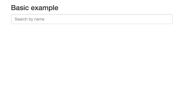
Here is what the basic example looks like:
Global Options
When initializing an autocomplete, there are a number of global options you can configure.
tabAutocomplete – If true, pressing tab will select the first rendered suggestion in the dropdown. Defaults to true.
hint – If false, the autocomplete will not show a hint. Defaults to true.
debug – If true, the autocomplete will not close on blur. Defaults to false.
clearOnSelected – If true, the autocomplete will empty the search box when a suggestion is selected. This is useful if you want to use this as a way to input tags using the selected event.
openOnFocus – If true, the dropdown menu will open when the input is focused. Defaults to false.
appendTo – If set with a DOM selector, doesn't wrap the input and appends the wrapper and dropdown menu to the first DOM element matching the selector. It automatically positions the wrapper under the input, and sets it to the same width as the input. Can't be used with hint: true, because hint requires the wrapper around the input.
dropdownMenuContainer – If set with a DOM selector, it overrides the container of the dropdown menu.
templates – An optional hash overriding the default templates.
dropdownMenu – the dropdown menu template. The template should include all dataset placeholders.
header – the header to prepend to the dropdown menu
footer – the footer to append to the dropdown menu
empty – the template to display when none of the datasets are returning results. The templating function
is called with a context containing the underlying query.
cssClasses – An optional hash overriding the default css classes.
root – the root classes. Defaults to algolia-autocomplete.
prefix – the CSS class prefix of all nested elements. Defaults to aa.
noPrefix - set this to true if you wish to not use any prefix. Without this option, all nested elements classes will have a leading dash. Defaults to false.
dropdownMenu – the dropdown menu CSS class. Defaults to dropdown-menu.
input – the input CSS class. Defaults to input.
hint – the hint CSS class. Defaults to hint.
suggestions – the suggestions list CSS class. Defaults to suggestions.
suggestion – the suggestion wrapper CSS class. Defaults to suggestion.
cursor – the cursor CSS class. Defaults to cursor.
dataset – the dataset CSS class. Defaults to dataset.
empty – the empty CSS class. Defaults to empty.
keyboardShortcuts - Array of shortcut that will focus the input. For example if you want to bind s and /
you can specify: keyboardShortcuts: ['s', '/']
ariaLabel - An optional string that will populate the aria-label attribute.
- ``` html
- <script type="text/template" id="my-custom-menu-template">
- <div class="my-custom-menu">
- <div class="row">
- <div class="col-sm-6">
- <div class="aa-dataset-d1"></div>
- </div>
- <div class="col-sm-6">
- <div class="aa-dataset-d2"></div>
- <div class="aa-dataset-d3"></div>
- </div>
- </div>
- </div>
- </script>
- <style>
- body {
- font-family: -apple-system, sans-serif;
- }
- .algolia-autocomplete {
- width: 100%;
- }
- .algolia-autocomplete .aa-input, .algolia-autocomplete .aa-hint {
- width: 100%;
- }
- .algolia-autocomplete .aa-hint {
- color: #999;
- }
- .algolia-autocomplete .aa-dropdown-menu {
- width: 100%;
- background-color: #fff;
- border: 1px solid #999;
- border-top: none;
- }
- .algolia-autocomplete .aa-dropdown-menu .aa-suggestion {
- cursor: pointer;
- padding: 5px 4px;
- }
- .algolia-autocomplete .aa-dropdown-menu .aa-suggestion.aa-cursor {
- background-color: #B2D7FF;
- }
- .algolia-autocomplete .aa-dropdown-menu .aa-suggestion em {
- font-weight: bold;
- font-style: normal;
- }
- .branding {
- font-size: 1.3em;
- margin: 0.5em 0.2em;
- }
- .branding img {
- height: 1.3em;
- margin-bottom: - 0.3em;
- }
- </style>
- <script>
- $('#search-input').autocomplete(
- {
- templates: {
- dropdownMenu: '#my-custom-menu-template',
- footer: '<div class="branding">Powered by <img src="https://www.algolia.com/static_assets/images/press/downloads/algolia-logo-light.svg" /></div>'
- }
- },
- [
- {
- source: $.fn.autocomplete.sources.hits(index1, { hitsPerPage: 5 }),
- name: 'd1',
- templates: {
- header: '<h4>List 1</h4>',
- suggestion: function(suggestion) {
- // FIXME
- }
- }
- },
- {
- source: $.fn.autocomplete.sources.hits(index2, { hitsPerPage: 2 }),
- name: 'd2',
- templates: {
- header: '<h4>List 2</h4>',
- suggestion: function(suggestion) {
- // FIXME
- }
- }
- },
- {
- source: $.fn.autocomplete.sources.hits(index3, { hitsPerPage: 2 }),
- name: 'd3',
- templates: {
- header: '<h4>List 3</h4>',
- suggestion: function(suggestion, answer) {
- // FIXME
- }
- }
- }
- ]
- );
- </script>
- ```
minLength – The minimum character length needed before suggestions start
getting rendered. Defaults to 1.
autoWidth – This option allow you to control the width of autocomplete wrapper. When false the autocomplete wrapper will not have the width style attribute and you are be able to put your specific width property in your css to control the wrapper. Default value is true.
One scenario for use this option. e.g. You have a max-width css attribute in your autocomplete-dropdown-menu and you need to width grows until fill the max-width. In this scenario you put a width: auto in your autocomplete wrapper css class and the max-width in your autocomplete dropdown class and all done.
Datasets
An autocomplete is composed of one or more datasets. When an end-user modifies the
value of the underlying input, each dataset will attempt to render suggestions for the
new value.
Datasets can be configured using the following options.
source – The backing data source for suggestions. Expected to be a function
with the signature (query, cb). It is expected that the function will
compute the suggestion set (i.e. an array of JavaScript objects) for query
and then invoke cb with said set. cb can be invoked synchronously or
asynchronously.
name – The name of the dataset. This will be appended to tt-dataset- to
form the class name of the containing DOM element. Must only consist of
underscores, dashes, letters (a-z), and numbers. Defaults to a random
number.
displayKey – For a given suggestion object, determines the string
representation of it. This will be used when setting the value of the input
control after a suggestion is selected. Can be either a key string or a
function that transforms a suggestion object into a string. Defaults to
value.
Example function usage: displayKey: function(suggestion) { return suggestion.nickname || suggestion.firstName }
templates – A hash of templates to be used when rendering the dataset. Note
a precompiled template is a function that takes a JavaScript object as its
first argument and returns a HTML string.
empty – Rendered when 0 suggestions are available for the given query.
Can be either a HTML string or a precompiled template. The templating function
is called with a context containing query, isEmpty, and any optional
arguments that may have been forwarded by the source:
function emptyTemplate({ query, isEmpty }, [forwarded args]).
footer – Rendered at the bottom of the dataset. Can be either a HTML
string or a precompiled template. The templating function
is called with a context containing query, isEmpty, and any optional
arguments that may have been forwarded by the source:
function footerTemplate({ query, isEmpty }, [forwarded args]).
header – Rendered at the top of the dataset. Can be either a HTML string
or a precompiled template. The templating function
is called with a context containing query, isEmpty, and any optional
arguments that may have been forwarded by the source:
function headerTemplate({ query, isEmpty }, [forwarded args]).
suggestion – Used to render a single suggestion. The templating function
is called with the suggestion, and any optional arguments that may have
been forwarded by the source: function suggestionTemplate(suggestion, [forwarded args]).
Defaults to the value of `displayKey` wrapped in a `p` tag i.e. `{{value}}
`.debounce – If set, will postpone the source execution until after debounce milliseconds
have elapsed since the last time it was invoked.
cache - If set to false, subsequent identical queries will always execute the source function for suggestions. Defaults to true.
Sources
A few helpers are provided by default to ease the creation of Algolia-based sources.
Hits
To build a source based on Algolia's hits array, just use:
- ``` js
- {
- source: autocomplete.sources.hits(indexObj, { hitsPerPage: 2 }),
- templates: {
- suggestion: function(suggestion, answer) {
- // FIXME
- }
- }
- }
- ```
PopularIn (aka "xxxxx in yyyyy")
To build an Amazon-like autocomplete menu, suggesting popular queries and for the most popular one displaying the associated categories, you can use the popularIn source:
- ``` js
- {
- source: autocomplete.sources.popularIn(popularQueriesIndexObj, { hitsPerPage: 3 }, {
- source: 'sourceAttribute', // attribute of the `popularQueries` index use to query the `index` index
- index: productsIndexObj, // targeted index
- facets: 'facetedCategoryAttribute', // facet used to enrich the most popular query
- maxValuesPerFacet: 3 // maximum number of facets returned
- }, {
- includeAll: true, // should it include an extra "All department" suggestion
- allTitle: 'All departments' // the included category label
- }),
- templates: {
- suggestion: function(suggestion, answer) {
- var value = suggestion.sourceAttribute;
- if (suggestion.facet) {
- // this is the first suggestion
- // and it has been enriched with the matching facet
- value += ' in ' + suggestion.facet.value + ' (' + suggestion.facet.count + ')';
- }
- return value;
- }
- }
- }
- ```
Custom source
The source options can also take a function. It enables you to have more control of the results returned by Algolia search. The function function(query, callback) takes 2 parameters
query: String: the text typed in the autocomplete
callback: Function: the callback to call at the end of your processing with the array of suggestions
- ``` js
- source: function(query, callback) {
- var index = client.initIndex('myindex');
- index.search(query, { hitsPerPage: 1, facetFilters: 'category:mycat' }).then(function(answer) {
- callback(answer.hits);
- }, function() {
- callback([]);
- });
- }
- ```
Or by reusing an existing source:
- ``` js
- var hitsSource = autocomplete.sources.hits(index, { hitsPerPage: 5 });
- source: function(query, callback) {
- hitsSource(query, function(suggestions) {
- // FIXME: Do stuff with the array of returned suggestions
- callback(suggestions);
- });
- }
- ```
Security
User-generated data: protecting against XSS
Malicious users may attempt to engineer XSS attacks by storing HTML/JS in their data. It is important that user-generated data be properly escaped before using it in an autocomplete.js template.
In order to easily do that, autocomplete.js provides you with a helper function escaping all HTML code but the highlighting tags:
- ``` js
- templates: {
- suggestion: function(suggestion) {
- var val = suggestion._highlightResult.name.value;
- return autocomplete.escapeHighlightedString(val);
- }
- }
- ```
If you did specify custom highlighting pre/post tags, you can specify them as 2nd and 3rd parameter:
- ``` js
- templates: {
- suggestion: function(suggestion) {
- var val = suggestion._highlightResult.name.value;
- return autocomplete.escapeHighlightedString(val, '<span class="highlighted">', '</span>');
- }
- }
- ```
FAQ
How can I Control-click on results and have them open in a new tab?
and not simple divs. Control-clicking on them will trigger the default browser
behavior and open suggestions in a new tab.
To also support keyboard navigation, you'll need to listen to the
autocomplete:selected event and change window.location to the destination
URL.
Note that you might need to check the value of context.selectionMethod in
autocomplete:selected first. If it's equal to click, you should return
early, otherwise your main window will also follow the link.
Here is an example of how it would look like:
- ``` js
- autocomplete(…).on('autocomplete:selected', function(event, suggestion, dataset, context) {
- // Do nothing on click, as the browser will already do it
- if (context.selectionMethod === 'click') {
- return;
- }
- // Change the page, for example, on other events
- window.location.assign(suggestion.url);
- });
- ```
Events
The autocomplete component triggers the following custom events.
autocomplete:opened – Triggered when the dropdown menu of the autocomplete is
opened.
autocomplete:shown – Triggered when the dropdown menu of the autocomplete is
shown (opened and non-empty).
autocomplete:empty – Triggered when all datasets are empty.
autocomplete:closed – Triggered when the dropdown menu of the autocomplete is
closed.
autocomplete:updated – Triggered when a dataset is rendered.
autocomplete:cursorchanged – Triggered when the dropdown menu cursor is moved
to a different suggestion. The event handler will be invoked with 3
arguments: the jQuery event object, the suggestion object, and the name of
the dataset the suggestion belongs to.
autocomplete:selected – Triggered when a suggestion from the dropdown menu is
selected. The event handler will be invoked with the following arguments: the jQuery
event object, the suggestion object, the name of the dataset the
suggestion belongs to and a context object. The context contains
a .selectionMethod key that can be either click, enterKey, tabKey or
blur, depending how the suggestion was selected.
autocomplete:cursorremoved – Triggered when the cursor leaves the selections
or its current index is lower than 0
autocomplete:autocompleted – Triggered when the query is autocompleted.
Autocompleted means the query was changed to the hint. The event handler will
be invoked with 3 arguments: the jQuery event object, the suggestion object,
and the name of the dataset the suggestion belongs to.
autocomplete:redrawn – Triggered when appendTo is used and the wrapper is resized/repositionned.
All custom events are triggered on the element initialized as the autocomplete.
API
jQuery
Turns any input[type="text"] element into an auto-completion menu. globalOptions is an
options hash that's used to configure the autocomplete to your liking. Refer to
Global Options for more info regarding the available configs. Subsequent
arguments (*datasets), are individual option hashes for datasets. For more
details regarding datasets, refer to Datasets.
- ```
- $(selector).autocomplete(globalOptions, datasets)
- ```
Example:
- ``` js
- $('.search-input').autocomplete({
- minLength: 3
- },
- {
- name: 'my-dataset',
- source: mySource
- });
- ```
jQuery#autocomplete('destroy')
Removes the autocomplete functionality and reverts the input element back to its
original state.
- ``` js
- $('.search-input').autocomplete('destroy');
- ```
jQuery#autocomplete('open')
Opens the dropdown menu of the autocomplete. Note that being open does not mean that
the menu is visible. The menu is only visible when it is open and has content.
- ``` js
- $('.search-input').autocomplete('open');
- ```
jQuery#autocomplete('close')
Closes the dropdown menu of the autocomplete.
- ``` js
- $('.search-input').autocomplete('close');
- ```
jQuery#autocomplete('val')
Returns the current value of the autocomplete. The value is the text the user has
entered into the input element.
- ``` js
- var myVal = $('.search-input').autocomplete('val');
- ```
jQuery#autocomplete('val', val)
Sets the value of the autocomplete. This should be used in place of jQuery#val.
- ``` js
- $('.search-input').autocomplete('val', myVal);
- ```
jQuery.fn.autocomplete.noConflict()
Returns a reference to the autocomplete plugin and reverts jQuery.fn.autocomplete
to its previous value. Can be used to avoid naming collisions.
- ``` js
- var autocomplete = jQuery.fn.autocomplete.noConflict();
- jQuery.fn._autocomplete = autocomplete;
- ```
Standalone
The standalone version API is similiar to jQuery's:
- ``` js
- var search = autocomplete(containerSelector, globalOptions, datasets);
- ```
Example:
- ``` js
- var search = autocomplete('#search', { hint: false }, [{
- source: autocomplete.sources.hits(index, { hitsPerPage: 5 })
- }]);
- search.autocomplete.open();
- search.autocomplete.close();
- search.autocomplete.getVal();
- search.autocomplete.setVal('Hey Jude');
- search.autocomplete.destroy();
- search.autocomplete.getWrapper(); // since autocomplete.js wraps your input into another div, you can access that div
- ```
You can also pass a custom Typeahead instance in Autocomplete.js constructor:
- ``` js
- var search = autocomplete('#search', { hint: false }, [{ ... }], new Typeahead({ ... }));
- ```
autocomplete.noConflict()
Returns a reference to the autocomplete plugin and reverts window.autocomplete
to its previous value. Can be used to avoid naming collisions.
- ``` js
- var algoliaAutocomplete = autocomplete.noConflict();
- ```
Contributing & releasing
see CONTRIBUTING.md
Credits
This library has originally been forked from Twitter's typeahead.js library.
