 探客时代
探客时代

prism-react-renderer
Renders highlighted Prism output to React (+ theming & vendored Prism)
README
[![Maintenance Status][maintenance-image]](#maintenance-status)
prism-react-renderer 🖌️
A lean Prism highlighter component for React
Comes with everything to render Prismjs highlighted code directly to React (Native) elements, global-pollution-free!
Why?
Maybe you need to render some extra UI with your Prismjs-highlighted code,
or maybe you'd like to manipulate what Prism renders completely,
or maybe you're just using Prism with React and are searching for an easier,
global-pollution-free way?
Then you're right where you want to be!
How?
This library tokenises code using Prism and provides a small render-props-driven
component to quickly render it out into React. This is why it even works with
React Native! It's bundled with a modified version of Prism that won't pollute
the global namespace and comes with
_(There's also an escape-hatch to use your own Prism setup, just in case)_
It also comes with its own VSCode-like theming format, which means by default
you can easily drop in different themes, use the ones this library ships with, or
create new ones programmatically on the fly.
_(If you just want to use your Prism CSS-file themes, that's also no problem)_
Table of Contents
- Usage
- children
- language
- code
- theme
- Prism
- state
- [getLineProps](#getlineprops)
- [getTokenProps](#gettokenprops)
- Theming
- FAQ
- LICENSE
Installation
This module is distributed via npm which is bundled with node and
should be installed as one of your project's dependencies:
- ```sh
- # npm
- npm install --save prism-react-renderer
- # yarn
- yarn add prism-react-renderer
- ```
This package also depends on react. Please make sure you
have those installed as well.
Usage
- ``` js
- import React from "react";
- import { render } from "react-dom";
- // import { createRoot } from "react-dom/client";
- import Highlight, { defaultProps } from "prism-react-renderer";
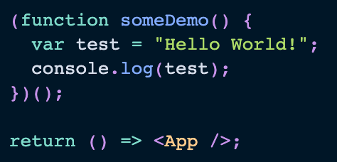
- const exampleCode = `
- (function someDemo() {
- var test = "Hello World!";
- console.log(test);
- })();
- return () => <App />;
- `;
- const Content = (
- <Highlight {...defaultProps} code={exampleCode} language="jsx">
- {({ className, style, tokens, getLineProps, getTokenProps }) => (
- <pre className={className} style={style}>
- {tokens.map((line, i) => (
- <div {...getLineProps({ line, key: i })}>
- {line.map((token, key) => (
- <span {...getTokenProps({ token, key })} />
- ))}
- </div>
- ))}
- </pre>
- )}
- </Highlight>
- );
- render(Content, document.getElementById('root'));
- // If you are using React 18
- // const root = createRoot(document.getElementById('root'));
- // root.render(Content);
- ```
It also exports a defaultProps object which for basic usage can simply be spread
onto the `It doesn't render anything itself, it just calls the render function and renders that.
`/* your JSX here! */}
Line Numbers
Add line numbers to your highlighted code blocks using the index parameter in your line.map function:
For example, if you were using styled-components, it could look like the following demo.
[Demo with styled-components](https://codesandbox.io/s/prism-react-renderer-example-u6vhk?file=/src/WithLineNumbers.js)
- ``` js
- import React from "react";
- import styled from "styled-components";
- import Highlight, { defaultProps } from "prism-react-renderer";
- import theme from "prism-react-renderer/themes/nightOwl";
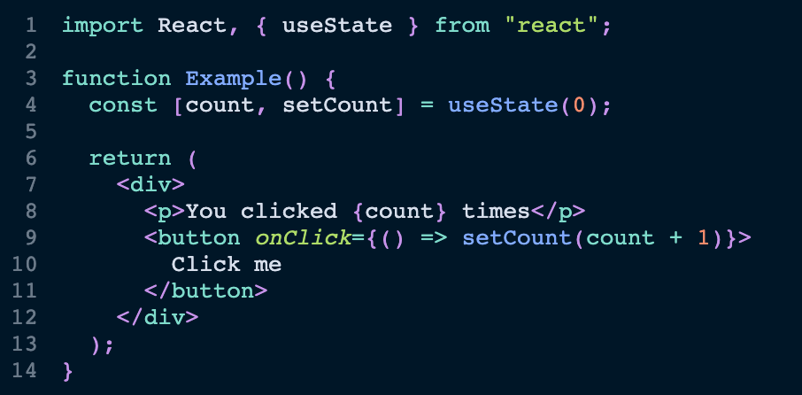
- const exampleCode = `
- import React, { useState } from "react";
- function Example() {
- const [count, setCount] = useState(0);
- return (
- <div>
- <p>You clicked {count} times</p>
- <button onClick={() => setCount(count + 1)}>
- Click me
- </button>
- </div>
- );
- }
- `.trim();
- const Pre = styled.pre`
- text-align: left;
- margin: 1em 0;
- padding: 0.5em;
- overflow: scroll;
- `;
- const Line = styled.div`
- display: table-row;
- `;
- const LineNo = styled.span`
- display: table-cell;
- text-align: right;
- padding-right: 1em;
- user-select: none;
- opacity: 0.5;
- `;
- const LineContent = styled.span`
- display: table-cell;
- `;
- const WithLineNumbers = () => (
- <Highlight {...defaultProps} theme={theme} code={exampleCode} language="jsx">
- {({ className, style, tokens, getLineProps, getTokenProps }) => (
- <Pre className={className} style={style}>
- {tokens.map((line, i) => (
- <Line key={i} {...getLineProps({ line, key: i })}>
- <LineNo>{i + 1}</LineNo>
- <LineContent>
- {line.map((token, key) => (
- <span key={key} {...getTokenProps({ token, key })} />
- ))}
- </LineContent>
- </Line>
- ))}
- </Pre>
- )}
- </Highlight>
- );
- export default WithLineNumbers;
- ```
Basic Props
This is the list of props that you should probably know about. There are some
advanced props below as well.
Most of these advanced props are included in thedefaultProps.
children
function({}) | _required_
This is called with an object. Read more about the properties of this object in
the section "Children Function".
language
string | _required_
This is the language that your code will be highlighted as. You can see a list
of all languages that are supported out of the box here. Not all languages are included and the list of languages that are currently is a little arbitrary. You can use the escape-hatch to use your own Prism setup, just in case, or add more languages to the bundled Prism.
code
string | _required_
This is the code that will be highlighted.
Advanced Props
theme
PrismTheme | _required; default is provided in defaultProps export_
If a theme is passed, it is used to generate style props which can be retrieved
via the prop-getters which are described in "Children Function".
A default theme is provided by the defaultProps object.
Read more about how to theme prism-react-renderer in
the section "Theming".
Prism
PrismLib | _required; default is provided in defaultProps export_
This is the Prismjs library itself.
A vendored version of Prism is provided (and also exported) as part of this library.
This vendored version doesn't pollute the global namespace, is slimmed down,
and doesn't conflict with any installation of prismjs you might have.
If you're only using Prism.highlight you can choose to use prism-react-renderer's
exported, vendored version of Prism instead.
But if you choose to use your own Prism setup, simply pass Prism as a prop:
- ``` js
- // Whichever way you're retrieving Prism here:
- import Prism from 'prismjs/components/prism-core';
- <Highlight Prism={Prism} {/* ... */} />
- ```
Children Function
You use it like so:
- ``` js
- const ui = (
- <Highlight>
- {highlight => (
- // use utilities and prop getters here, like highlight.className, highlight.getTokenProps, etc.
- <pre>{/* more jsx here */}</pre>
- )}
- </Highlight>
- );
- ```
The properties of this highlight object can be split into two categories as indicated below:
state
you'd usually expect from a render-props-based API.
| property | type | description |
|---|---|---|
| ----------- | ----------- | ---------------------------------------------------------------------------------------------------------------------------- |
| `tokens` | `Token[][]` | This |
| `className` | `string` | This |
A "Token" is an object that represents a piece of content for Prism. It has a types property, which is an array
of types that indicate the purpose and styling of a piece of text, and a content property, which is the actual
text.
You'd typically iterate over tokens, rendering each line, and iterate over its items, rendering out each token, which is a piece of
this line.
prop getters
See
These functions are used to apply props to the elements that you render. This
gives you maximum flexibility to render what, when, and wherever you like.
You'd typically call these functions with some dictated input and add on all other
props that it should pass through. It'll correctly override and modify the props
that it returns to you, so passing props to it instead of adding them directly is
advisable.
| property | type | description |
|---|---|---|
| --------------- | -------------- | ----------------------------------------------------------------------------------------------------- |
| `getLineProps` | `function({})` | returns |
| `getTokenProps` | `function({})` | returns |
getLineProps
You need to add a line property (type: Token[]) to the object you're passing to
getLineProps; It's also advisable to add a key.
s`).
This getter will return you props to spread onto your token elements (typically `s`).
While all `className`s are provided with `
It will typically return a className (if you pass one it'll be appended), children,
style (if you pass one it'll be merged). It also passes on all other props you pass
to the input.
The className will always contain .token-line.
getTokenProps
You need to add a token property (type: Token) to the object you're passing to
getTokenProps; It's also advisable to add a key.
It will typically return a className (if you pass one it'll be appended), children,
style (if you pass one it'll be merged). It also passes on all other props you pass
to the input.
The className will always contain .token. This also provides full compatibility with
your old Prism CSS-file themes.
Theming
The defaultProps you'd typically apply in a basic use-case, contain a default theme.
This theme is duotoneDark.
old Prism CSS-file themes, you can also choose to use prism-react-renderer's themes like so:
- ``` js
- import dracula from 'prism-react-renderer/themes/dracula';
- <Highlight theme={dracula} {/* ... */} />
- ```
These themes are JSON-based and are heavily inspired by VSCode's theme format.
Their syntax, expressed in Flow looks like the following:
- ``` js
- {
- plain: StyleObj,
- styles: Array<{
- types: string[],
- languages?: string[],
- style: StyleObj
- }>
- }
- ```
The plain property provides a base style-object. This style object is directly used
in the style props that you'll receive from the prop getters, if a theme prop has
been passed to `The styles property contains an array of definitions. Each definition contains a style
property, that is also just a style object. These styles are limited by the types
and languages properties.
The types properties is an array of token types that Prism outputs. The languages
property limits styles to highlighted languages.
When converting a Prism CSS theme it's mostly just necessary to use classes as
types and convert the declarations to object-style-syntax and put them on style.
FAQ
How do I add more language highlighting support?
By default prism-react-renderer only includes an arbitrary subset of the languages that Prism supports. You can add support for more by including their definitions from the mainprismjs package:
- ``` js
- import Prism from "prism-react-renderer/prism";
- (typeof global !== "undefined" ? global : window).Prism = Prism;
- require("prismjs/components/prism-kotlin");
- require("prismjs/components/prism-csharp");
- ```
How do I use my old Prism css themes?
prism-react-renderer still returns you all proper classNames via the prop getters,
when you use it. By default however it uses its new theming system, which output a
couple of style props as well.
outputting any style props, while still returning you the className props, like
so:
- ``` js
- <Highlight
- {...defaultProps}
- code={exampleCode}
- language="jsx"
- theme={undefined}
- >
- {highlight => null /* ... */}
- </Highlight>
- ```
How do I prevent a theme and the vendored Prism to be bundled?
Since the default theme and the vendored Prism library in prism-react-renderer
come from defaultProps, if you wish to pass your own Prism library in, and not
use the built-in theming, you simply need to leave it out to allow your bundler
to tree-shake those:
- ``` js
- import Highlight from "prism-react-renderer";
- import Prism from "prismjs"; // Different source
- <Highlight Prism={Prism} code={exampleCode} language="jsx">
- {highlight => null /* ... */}
- </Highlight>;
- ```
You can also import the vendored Prism library on its own:
- ``` js
- import { Prism } from "prism-react-renderer";
- // or
- import Prism from "prism-react-renderer/prism";
- ```
LICENSE
MIT
Maintenance Status
Active: Formidable is actively working on this project, and we expect to continue for work for the foreseeable future. Bug reports, feature requests and pull requests are welcome.
[maintenance-image]: https://img.shields.io/badge/maintenance-active-green.svg
为什么是最好的 GitHub 项目?
技术的发展速度比以往任何时候都快,技术正在全速创新。几乎每天都会发布惊人的开源项目。
如何快速检查真正重要的项目,现在而不是 6 个月前?
探客时代每天拍摄 GitHub stars 的 “快照”,以获得 2000 多个项目的精选列表,以检测过去几个月的趋势。
我们不会扫描 GitHub 上的所有现有项目,而是根据我们的经验和我们在 Internet 上阅读的内容,专注于我们发现 “有趣” 的精选项目列表。想要了解的项目可以提交给我们。
关注公众号
