 探客时代
探客时代

React Arborist
The complete tree view component for React
README

React Arborist
The tree view is ubiquitous in software applications. This library provides the React ecosystem with a complete solution to build the equivalent of a VSCode sidebar, Mac Finder, Windows Explorer, or Sketch/Figma layers panel.
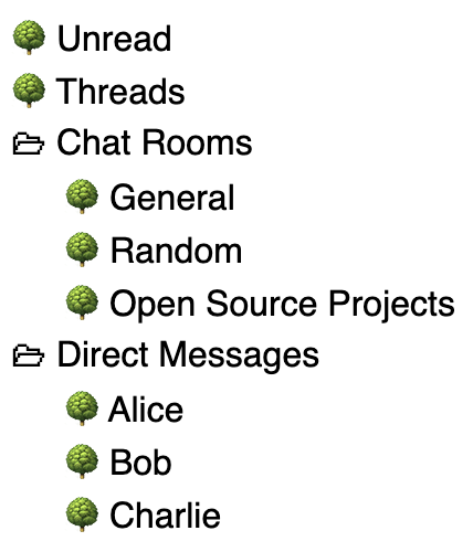
Here is a Gmail sidebar clone built with react-arborist.

Features
- Drag and drop sorting
- Open/close folders
- Inline renaming
- Virtualized rendering
- Custom styling
- Keyboard navigation
- Aria attributes
- Tree filtering
- Selection synchronization
- Callbacks (onScroll, onActivate, onSelect)
- Controlled or uncontrolled trees
Installation
- ```
- yarn add react-arborist
- ```
- ```
- npm install react-arborist
- ```
Examples
Assume our data is this:
- ```js
- const data = [
- { id: "1", name: "Unread" },
- { id: "2", name: "Threads" },
- {
- id: "3",
- name: "Chat Rooms",
- children: [
- { id: "c1", name: "General" },
- { id: "c2", name: "Random" },
- { id: "c3", name: "Open Source Projects" },
- ],
- },
- {
- id: "4",
- name: "Direct Messages",
- children: [
- { id: "d1", name: "Alice" },
- { id: "d2", name: "Bob" },
- { id: "d3", name: "Charlie" },
- ],
- },
- ];
- ```
The Simplest Tree
Use all the defaults. The _initialData_ prop makes the tree an uncontrolled component. Create, move, rename, and delete will be handled internally.
- ```jsx
- function App() {
- return <Tree initialData={data} />;
- }
- ```
Customize the Appearance
We provide our own dimensions and our own Node component.
- ```jsx
- function App() {
- return (
- <Tree
- initialData={data}
- openByDefault={false}
- width={600}
- height={1000}
- indent={24}
- rowHeight={36}
- overscanCount={1}
- paddingTop={30}
- paddingBottom={10}
- padding={25 /* sets both */}
- >
- {Node}
- </Tree>
- );
- }
- function Node({ node, style, dragHandle }) {
- /* This node instance can do many things. See the API reference. */
- return (
- <div style={style} ref={dragHandle}>
- {node.isLeaf ? "🍁" : "🗀"}
- {node.data.name}
- </div>
- );
- }
- ```

Control the Tree data
Here we use the _data_ prop to make the tree a controlled component. We must handle all the data modifications ourselves using the props below.
- ```jsx
- function App() {
- /* Handle the data modifications outside the tree component */
- const onCreate = ({ parentId, index, type }) => {};
- const onRename = ({ id, name }) => {};
- const onMove = ({ dragIds, parentId, index }) => {};
- const onDelete = ({ ids }) => {};
- return (
- <Tree
- data={data}
- onCreate={onCreate}
- onRename={onRename}
- onMove={onMove}
- onDelete={onDelete}
- />
- );
- }
- ```
Tree Filtering
Providing a non-empty _searchTerm_ will only show nodes that match. If a child matches, all its parents also match. Internal nodes are opened when filtering. You can provide your own _searchMatch_ function, or use the default.
- ```jsx
- function App() {
- const term = useSearchTermString()
- <Tree
- data={data}
- searchTerm={term}
- searchMatch={
- (node, term) => node.data.name.toLowerCase().includes(term.toLowerCase())
- }
- />
- }
- ```
Sync the Selection
It's common to open something elsewhere in the app, but have the tree reflect the new selection.
Passing an id to the _selection_ prop will select and scroll to that node whenever that id changes.
- ```jsx
- function App() {
- const chatId = useCurrentChatId();
- /*
- Whenever the currentChatRoomId changes,
- the tree will automatically select it and scroll to it.
- */
- return <Tree initialData={data} selection={chatId} />;
- }
- ```
Use the Tree Api Instance
You can access the Tree Api in the parent component by giving a ref to the tree.
- ```jsx
- function App() {
- const treeRef = useRef();
- useEffect(() => {
- const tree = treeRef.current;
- tree.selectAll();
- /* See the Tree API reference for all you can do with it. */
- }, []);
- return <Tree initialData={data} ref={treeRef} />;
- }
- ```
Data with Different Property Names
The _idAccessor_ and _childrenAccessor_ props allow you to specify the children and id fields in your data.
- ```jsx
- function App() {
- const data = [
- {
- category: "Food",
- subCategories: [{ category: "Restaurants" }, { category: "Groceries" }],
- },
- ];
- return (
- <Tree
- data={data}
- /* An accessor can provide a string property name */
- idAccessor="category"
- /* or a function with the data as the argument */
- childrenAccessor={(d) => d.subCategories}
- />
- );
- }
- ```
Custom Rendering
Render every single piece of the tree yourself. See the API reference for the props passed to each renderer.
- ```jsx
- function App() {
- return (
- <Tree
- data={data}
- /* The outer most element in the list */
- renderRow={MyRow}
- /* The "ghost" element that follows the mouse as you drag */
- renderDragPreview={MyDragPreview}
- /* The line that shows where an element will be dropped */
- renderCursor={MyCursor}
- >
- {/* The inner element that shows the indentation and data */}
- {MyNode}
- </Tree>
- );
- }
- ```
API Reference
- Components
- Interfaces
- Node API
- Tree API
Tree Component Props
These are all the props you can pass to the Tree component.
- ```ts
- interface TreeProps<T> {
- /* Data Options */
- data?: readonly T[];
- initialData?: readonly T[];
- /* Data Handlers */
- onCreate?: handlers.CreateHandler<T>;
- onMove?: handlers.MoveHandler<T>;
- onRename?: handlers.RenameHandler<T>;
- onDelete?: handlers.DeleteHandler<T>;
- /* Renderers*/
- children?: ElementType<renderers.NodeRendererProps<T>>;
- renderRow?: ElementType<renderers.RowRendererProps<T>>;
- renderDragPreview?: ElementType<renderers.DragPreviewProps>;
- renderCursor?: ElementType<renderers.CursorProps>;
- renderContainer?: ElementType<{}>;
- /* Sizes */
- rowHeight?: number;
- overscanCount?: number;
- width?: number | string;
- height?: number;
- indent?: number;
- paddingTop?: number;
- paddingBottom?: number;
- padding?: number;
- /* Config */
- childrenAccessor?: string | ((d: T) => T[] | null);
- idAccessor?: string | ((d: T) => string);
- openByDefault?: boolean;
- selectionFollowsFocus?: boolean;
- disableMultiSelection?: boolean;
- disableEdit?: string | boolean | BoolFunc<T>;
- disableDrag?: string | boolean | BoolFunc<T>;
- disableDrop?:
- | string
- | boolean
- | ((args: {
- parentNode: NodeApi<T>;
- dragNodes: NodeApi<T>[];
- index: number;
- }) => boolean);
- /* Event Handlers */
- onActivate?: (node: NodeApi<T>) => void;
- onSelect?: (nodes: NodeApi<T>[]) => void;
- onScroll?: (props: ListOnScrollProps) => void;
- onToggle?: (id: string) => void;
- onFocus?: (node: NodeApi<T>) => void;
- /* Selection */
- selection?: string;
- /* Open State */
- initialOpenState?: OpenMap;
- /* Search */
- searchTerm?: string;
- searchMatch?: (node: NodeApi<T>, searchTerm: string) => boolean;
- /* Extra */
- className?: string | undefined;
- rowClassName?: string | undefined;
- dndRootElement?: globalThis.Node | null;
- onClick?: MouseEventHandler;
- onContextMenu?: MouseEventHandler;
- dndManager?: DragDropManager;
- }
- ```
Row Component Props
- ```ts
- type RowRendererProps<T> = {
- node: NodeApi<T>;
- innerRef: (el: HTMLDivElement | null) => void;
- attrs: HTMLAttributes<any>;
- children: ReactElement;
- };
- ```
Node Component Props
- ```ts
- export type NodeRendererProps<T> = {
- style: CSSProperties;
- node: NodeApi<T>;
- tree: TreeApi<T>;
- dragHandle?: (el: HTMLDivElement | null) => void;
- preview?: boolean;
- };
- ```
DragPreview Component Props
- ```ts
- type DragPreviewProps = {
- offset: XYCoord | null;
- mouse: XYCoord | null;
- id: string | null;
- dragIds: string[];
- isDragging: boolean;
- };
- ```
Cursor Component Props
- ```ts
- export type CursorProps = {
- top: number;
- left: number;
- indent: number;
- };
- ```
Node API Reference
State Properties
All these properties on the node instance return booleans related to the state of the node.
_node_.isRoot
Returns true if this is the root node. The root node is added internally by react-arborist and not shown in the UI.
_node_.isLeaf
Returns true if the children property is not an array.
_node_.isInternal
Returns true if the children property is an array.
_node_.isOpen
Returns true if node is internal and in an open state.
_node_.isEditing
Returns true if this node is currently being edited. Use this property in the NodeRenderer to render the rename form.
_node_.isSelected
Returns true if node is selected.
_node_.isSelectedStart
Returns true if node is the first of a contiguous group of selected nodes. Useful for styling.
_node_.isSelectedEnd
Returns true if node is the last of a contiguous group of selected nodes. Useful for styling.
_node_.isOnlySelection
Returns true if node is the only node selected in the tree.
_node_.isFocused
Returns true if node is focused.
_node_.isDragging
Returns true if node is being dragged.
_node_.willReceiveDrop
Returns true if node is internal and the user is hovering a dragged node over it.
_node_.state
Returns an object with all the above properties as keys and boolean values. Useful for adding class names to an element with a library like clsx or classnames.
- ```ts
- type NodeState = {
- isEditing: boolean;
- isDragging: boolean;
- isSelected: boolean;
- isSelectedStart: boolean;
- isSelectedEnd: boolean;
- isFocused: boolean;
- isOpen: boolean;
- isClosed: boolean;
- isLeaf: boolean;
- isInternal: boolean;
- willReceiveDrop: boolean;
- };
- ```
Accessors
_node_.childIndex
Returns the node's index in relation to its siblings.
_node_.next
Returns the next visible node. The node directly under this node in the tree component. Returns null if none exist.
_node_.prev
Returns the previous visible node. The node directly above this node in the tree component. Returns null if none exist.
_node_.nextSibling
Returns the next sibling in the data of this node. Returns null if none exist.
Selection Methods
_node_.select()
Select only this node.
_node_.deselect()
Deselect this node. Other nodes may still be selected.
_node_.selectMulti()
Select this node while maintaining all other selections.
_node_.selectContiguous()
Deselect all nodes from the anchor node to the last selected node, the select all nodes from the anchor node to this node. The anchor changes to the focused node after calling _select()_ or _selectMulti()_.
Activation Methods
_node_.activate()
Runs the Tree props' onActivate callback passing in this node.
_node_.focus()
Focus this node.
Open/Close Methods
_node_.open()
Opens the node if it is an internal node.
_node_.close()
Closes the node if it is an internal node.
_node_.toggle()
Toggles the open/closed state of the node if it is an internal node.
_node_.openParents()
Opens all the parents of this node.
_node_.edit()
Moves this node into the editing state. Calling node._isEditing_ will return true.
_node_.submit(_newName_)
Submits _newName_ string to the _onRename_ handler. Moves this node out of the editing state.
_node_.reset()
Moves this node out of the editing state without submitting a new name.
Event Handlers
_node_.handleClick(_event_)
Useful for using the standard selection methods when a node is clicked. If the meta key is down, call _multiSelect()_. If the shift key is down, call _selectContiguous()_. Otherwise, call _select()_ and _activate()_.
Tree API Reference
The tree api reference is stable across re-renders. It always has the most recent state and props.
Node Accessors
_tree_.get(_id_) : _NodeApi | null_
Get node by id from the _visibleNodes_ array.
_tree_.at(_index_) : _NodeApi | null_
Get node by index from the _visibleNodes_ array.
_tree_.visibleNodes : _NodeApi[]_
Returns an array of the visible nodes.
_tree_.firstNode : _NodeApi | null_
The first node in the _visibleNodes_ array.
_tree_.lastNode : _NodeApi | null_
The last node in the _visibleNodes_ array.
_tree_.focusedNode : _NodeApi | null_
The currently focused node.
_tree_.mostRecentNode : _NodeApi | null_
The most recently selected node.
_tree_.nextNode : _NodeApi | null_
The node directly after the _focusedNode_ in the _visibleNodes_ array.
_tree_.prevNode : _NodeApi | null_
The node directly before the _focusedNode_ in the _visibleNodes_ array.
Focus Methods
_tree_.hasFocus : _boolean_
Returns true if the the tree has focus somewhere within it.
_tree_.focus(_id_)
Focus on the node with _id_.
_tree_.isFocused(_id_) : _boolean_
Check if the node with _id_ is focused.
_tree_.pageUp()
Move focus up one page.
_tree_.pageDown()
Move focus down one page.
Selection Methods
Returns a set of ids that are selected.
_tree_.selectedNodes : _NodeApi[]_
Returns an array of nodes that are selected.
_tree_.hasNoSelection : boolean
Returns true if nothing is selected in the tree.
_tree_.hasSingleSelection : boolean
Returns true if there is only one selection.
_tree_.hasMultipleSelections : boolean
Returns true if there is more than one selection.
_tree_.isSelected(_id_) : _boolean_
Returns true if the node with _id_ is selected.
_tree_.select(_id_)
Select only the node with _id_.
_tree_.deselect(_id_)
Deselect the node with _id_.
_tree_.selectMulti(_id_)
Add to the selection the node with _id_.
_tree_.selectContiguous(_id_)
Deselected nodes between the anchor and the last selected node, then select the nodes between the anchor and the node with _id_.
_tree_.deselectAll()
Deselect all nodes.
_tree_.selectAll()
Select all nodes.
Visibility
_tree_.open(_id_)
Open the node with _id_.
_tree_.close(_id_)
Close the node with _id_.
_tree_.toggle(_id_)
Toggle the open state of the node with _id_.
_tree_.openParents(_id_)
Open all parents of the node with _id_.
_tree_.openSiblings(_id_)
Open all siblings of the node with _id_.
_tree_.openAll()
Open all internal nodes.
_tree_.closeAll()
Close all internal nodes.
_tree_.isOpen(_id_) : _boolean_
Returns true if the node with _id_ is open.
Drag and Drop
_tree_.isDragging(_id_) : _boolean_
Returns true if the node with _id_ is being dragged.
_tree_.willReceiveDrop(_id_) : _boolean_
Returns true if the node with _id_ is internal and is under the dragged node.
Scrolling
_tree_.scrollTo(_id_, _[align]_)
Scroll to the node with _id_. If this node is not visible, this method will open all its parents. The align argument can be _"auto" | "smart" | "center" | "end" | "start"_.
Properties
_tree_.isEditing : _boolean_
Returns true if the tree is editing a node.
_tree_.isFiltered : _boolean_
Returns true if the _searchTerm_ prop is not an empty string when trimmed.
_tree_.props : _TreeProps_
_tree_.root : _NodeApi_
Returns the root _NodeApi_ instance. Its children are the Node representations of the _data_ prop array.
